Prompt Guidance
Slide Background: Pick It by Contrast, Not by Thumbnail
A background is judged in the band behind the text, not as a picture on its own. This is the brief this guide starts from: fill it, set the image as the slide background, then measure the contrast before the deck goes out.
Optional
JPG / PNG / WebP
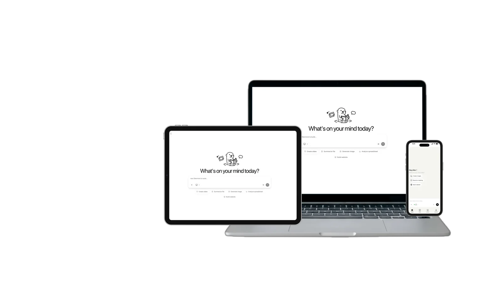
This is Ottermind's composer. Filling the brief and sending are separate actions, and no image is generated until you continue in Studio.
November 16, 2026 · 14 min read
A slide background is the fill that sits behind every other object on a slide — a colour, a gradient, a pattern, or a photograph. In PowerPoint it is a property of the slide rather than a picture pasted onto the canvas, which is why one setting can be applied to a single slide or to the whole file at once, and why the layer you are least likely to look at is the one that decides whether the deck is readable.
The usual mistake is choosing it the way you choose a poster: by thumbnail. Background galleries are organised by how good a picture looks alone, and a picture looks good alone when it has a strong subject in the middle, high local contrast, and detail spread across the frame — the three properties that leave nowhere to put a title. The second mistake is measuring contrast against the average of the image instead of the pixels under the letters, so a slide that scores well overall still has a word disappearing into a bright window.
How this guide was checked: Sizing and the background controls come from Microsoft Support pages opened on November 16, 2026: Change the size of your slides (widescreen 13.333 in × 7.5 in, standard 4:3 at 10 in × 7.5 in) and Change the background of slides (Design → Background Styles → Format Background; solid, gradient, pattern and picture fills; Apply to All; Reset Background; and the note that PowerPoint for the web does not support gradient fills for slide backgrounds). Contrast thresholds come from WCAG 2.2, Success Criterion 1.4.3, which requires 4.5:1 for normal text and 3:1 for large-scale text defined as at least 18 point or 14 point bold. The contrast figures quoted for the two example backgrounds were measured on the delivered image files with the WCAG relative-luminance formula. The cover, the comparison pair, the tonal field and the four-frame series were generated for this article with GPT Image 2.5 Flare on November 16, 2026, and the cover's type was set over that artwork afterwards; they are illustrations, not screenshots of a presentation app, and not photographs of a real room. The one real interface capture is the final figure, labelled where it appears. No projector was available to test on, so every claim about how a projection behaves is flagged where it appears.
What the background actually has to survive
Four things, and all four are measurable before the deck leaves your machine. Everything else about a background — how expensive it looks, whether the subject is interesting, whether it matches the brand — is a judgement made after these four pass.
1. Contrast in the band where the text sits. WCAG 2.2 puts the floor at 4.5:1 for normal text and 3:1 for large text, where large means at least 18 point, or 14 point bold. A slide title at 40 point can sit at 3:1 and be legitimate; the eight lines of body copy under it cannot. The number that matters is the worst pixel under a glyph, not the image average, because text is not spread evenly across the frame — it lands wherever the composition happens to be busiest.
2. A quiet area big enough for the text you actually have. Not "some space" — a measurable share of the frame with no edges, no faces, no text, no repeating pattern. On a 16:9 slide, a title plus three bullets typically needs 35–45% of the frame in one connected region, usually the left third or the top band. If the image has no such region, the answer is a different image, not a heavier drop shadow.
3. The right aspect and enough pixels. A widescreen slide is 13.333 in × 7.5 in, which is 16:9; the standard 4:3 slide is 10 in × 7.5 in. Slides are measured in inches, so convert deliberately: at 96 pixels per inch — the pixel density a screen-standard inch maps to — a 16:9 slide is 1,280 × 720 px, and the same slide at 150 ppi is 2,000 × 1,125 px. Generating at 1,536 × 864 gives you headroom for a little cropping without upscaling. Stretching a square image into 16:9 does not add pixels; it just moves the distortion into the subject.
4. A tonal structure that survives being scaled down and projected. Fine texture and twenty-step gradients look luxurious at full size and turn into grain, mud or banding at projection size. The fix is fewer tonal steps, not more detail.
| What to measure | Passes when | What the failure looks like |
|---|---|---|
| Contrast under the title | ≥ 4.5:1 for body text, ≥ 3:1 for text at 18 pt or larger | Looks fine on a laptop, loses its edges on a projector |
| Quiet region | One connected 35–45% area with no edges | Subject dead centre; every corner has something in it |
| Aspect and pixel width | 16:9 at ≥ 1,600 px wide for a 13.333 in slide | Square or 4:3 image stretched, subject widened |
| Tonal steps | Roughly five to six visible steps across the frame | Banding rings, or a photo that reads as noise at 30% zoom |
| Series consistency | Same palette, light direction and horizon height across slides | Five slides that look like five different decks |
The five-minute test before you set it
This is the part that most background advice skips, and it is the only part that catches the expensive mistakes.
- Set the real slide size first. Design → Slide Size → Widescreen (13.333 in × 7.5 in), or match whatever the file already uses. A background judged on a 4:3 canvas gets cropped differently the moment the deck is 16:9.
- Put the real text on it, at the real size. An actual headline and an actual paragraph, in the actual font. Lorem ipsum at 60 point hides every problem.
- Sample the band, not the picture. Take the darkest and lightest pixels behind the letters with an eyedropper, convert each to relative luminance, and compute (lighter + 0.05) ÷ (darker + 0.05). That is the ratio WCAG uses. If you would rather not do the arithmetic, a contrast checker that accepts two colours gives the same answer.
- Look at it at 25% and from three metres. Banding and grain appear at the first; lost contrast appears at the second. Both are cheaper to fix now than in the room.
- Crop-check the card and the cover. The same file is usually reused as a thumbnail, a section divider and a title slide. Decide which part of the frame must survive the crop before you commit.
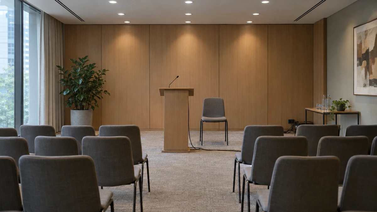
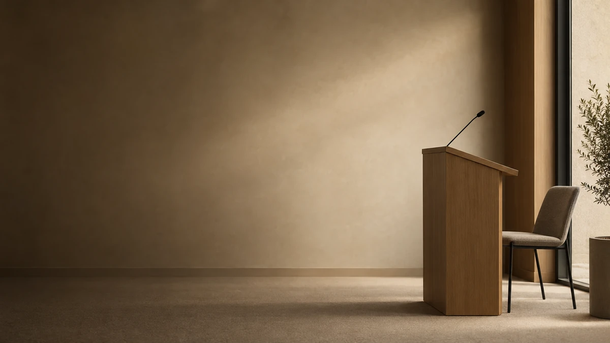
Two briefs, one variable: where the subject sits. On the left, a 599 × 224 px title band starting at 6% from the left edge contains both a dark wall and a bright ceiling edge; measured with the WCAG formula, white text over that band ranges from 14.3:1 at its darkest to 1.9:1 where it crosses the light — a headline whose last word may or may not be legible depending on where it lands. On the right, the same room with the subject pushed aside: white text over the band now runs from 12.6:1 to 4.1:1, so a 40-point title clears 3:1 everywhere and body copy clears 4.5:1 across most of the band. Both are AI-generated illustrations for this article, not screenshots; the numbers are measured on the files, not estimated.
Seven briefs, one variable each
Everything below is a natural-language brief you can paste into an image prompt. Each block changes one thing, so when a result misses you know which sentence to edit rather than rewriting the whole paragraph.
1. The title-band lock
The brief this page's composer starts from. It fixes where the subject sits and how light the text band is allowed to get.
16:9 photographic background for a presentation slide. Subject: a small modern conference room with a lectern, shot from the side so the lectern sits in the right third and faces left. Left two thirds: one empty warm plaster wall with a single soft daylight gradient, no furniture, no cable, no repeating pattern, and nothing at all in the top 15 percent of the frame. Keep the left panel between 20 and 30 percent lightness so white text holds. 50mm lens at f/4, soft window light from the left, muted warm grey palette, realistic texture, no text, no logo, no border, no vignette.What it controls: the subject's position and the lightness of the band the text will occupy — the two variables that decide contrast. To shift it: keep the geometry sentence word for word and change only the subject; if you need dark text instead of white, ask for the left panel at 85–92 percent lightness rather than 20–30.
2. The low-frequency field for a data slide
Charts and big numbers need a background with no focal point at all. Anything the eye can name competes with the chart.
16:9 abstract background for a slide with one chart and four numbers. A smooth vertical gradient from deep slate teal at the top to near-black navy at the bottom, no more than five visible tone steps across the whole frame, one broad arc of slightly lighter teal crossing the lower third, nothing else: no stars, no particles, no glow, no light streaks, no texture, no vignette. Matte finish, clean gradient edges, printable.What it controls: tonal complexity and focal absence. To shift it: for print, raise the darkest tone to charcoal so the printer does not turn the bottom into an ink puddle; for a light deck, invert the range but keep the step count.

The field from brief 2, as delivered. Measured across the same title band, white text holds between 9.9:1 and 11.6:1 at every sampled pixel — no bright spot for a word to fall into. That stability is the property being bought here, not the colour.
3. Near-white paper for dense text
When the slide is mostly reading, the background's job is to stay out of the way. A flat white rectangle is fine; a white rectangle with a story is better, provided the story is smaller than a letter.
16:9 background: warm uncoated white paper photographed flat, filling the frame, lightness above 92 percent everywhere, faint fibre and two very soft handling shadows in opposite corners, no repeating pattern, no vignette, no objects, no gradient across the middle. Stay quiet at text size: nothing smaller than the width of a letter should be visible in the central 70 percent of the frame.What it controls: keeping black body text at maximum contrast while avoiding the sterile look of a plain fill. To shift it: allow one object in a corner for a section cover, and keep the centre empty; swap paper for painted plaster if the deck is warmer.
4. The section divider
A divider carries four words and one number, so it needs the opposite ratio of everything else: 70% empty frame, one subject, one edge.
16:9 art for a section divider. One object only — a single stack of matte ceramic tiles — small, in the lower right corner, lit from behind so only its edge catches light. The other 70 percent of the frame is an almost plain dark field, one tone, no banding, no particles. Leave room for a large numeral in the upper left. No text, no logo, no frame.What it controls: reserving space for oversized type. To shift it: move the object to whichever corner your layout leaves free, and change only that clause.
5. The series lock
A deck stops looking designed the moment each slide's background comes from a different prompt. This is the brief as a template rather than a paragraph: three fixed sentences, one variable clause.
Fixed: 16:9 photographic background, pale coastal fog at dawn, horizon low in the frame, the upper four fifths a luminous grey-beige field with nothing in it, 85mm lens, long exposure, muted warm grey, no text, no logo.
Variable: [no objects at all] / [one dark dune ridge along the bottom edge] / [two distant rocks in the right third] / [deeper dusk light and a faint sand line].
What it controls: deck-level consistency — palette, light direction and horizon height across every slide. To shift it: keep the fixed part verbatim between generations; the moment you paraphrase it, the series drifts.
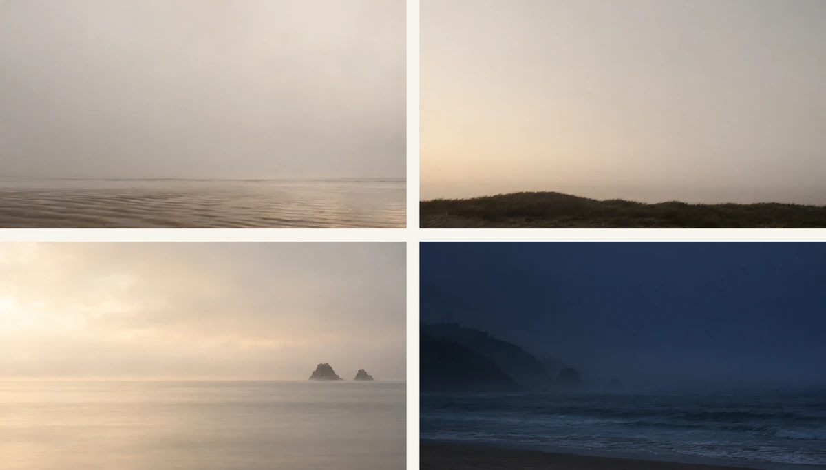
Four runs of the series brief, in order, with only the variable clause changed. Palette, lens and horizon height hold; the light moves from dawn to dusk as the fourth clause asks. Consistency across a deck is a copy-paste discipline, not a model feature.
6. The recompose prompt
When a background fails the band test, most people start over. Often the scene is right and only the framing is wrong, which is a smaller thing to ask for.
Recompose the same scene: move the lectern and chairs into the right third, clear the left two thirds to one empty wall, remove the ceiling lights from the top 20 percent of the frame, and keep the lens, light direction and palette identical. Same room, same hour, only the framing and the emptiness change. No text.What it controls: framing, without re-deciding the subject's look. To shift it: name the percentage of the frame to clear; "more space" is not a measurable instruction. Expect a new image rather than a crop of the old one — the pixels will differ.
7. The projector and print flattening pass
The last step, for anything that will be projected or printed. It deliberately removes detail.
Flatten the tonal range of this background: reduce it to three visible tone steps, raise the mid-tone floor so the darkest area is not black, remove all texture finer than two percent of the frame width, and keep one large shape. The result should still read as [the subject] at a quarter of its size. No text, no logo.What it controls: how the image behaves when it is scaled down, compressed and thrown across a room. To shift it: for print, keep two steps and raise the floor further; for a dark-on-dark deck, do not raise the floor at all and accept that the print version needs its own file.
What goes wrong, and the cheapest fix
These failures look like taste problems and are almost always specification problems. Fix the sentence before you regenerate.
| What you see | What caused it | The cheapest fix |
|---|---|---|
| The title's last word fades into a bright area | Contrast measured on the image average, not under the glyphs | Sample the band, then ask for a darker or flatter band in the brief |
| The slide looks fine on a laptop, washed out on a projector | 4.5:1 against a monitor's brightness is not 4.5:1 in a lit room | Test on the actual device; if you cannot, add a scrim in the deck rather than re-prompting |
| Visible rings or grain in a gradient | Too many tonal steps for 8-bit display or print | Cut to five steps, or accept a flat fill |
| The subject is cut in half by the 16:9 crop | Image generated at 1:1 or 4:3 and stretched | Generate at 16:9, then crop-test with the real slide size |
| Five slides that look like five decks | Each background from a separate prompt | Series lock: fixed sentences, one variable clause |
| Lettering baked into the image | The prompt asked for a caption or a logo | Generate without text; set type in the deck where it can be edited and translated |
| A background that is beautiful and useless | It was picked as a picture, never as a backdrop | Run the five-minute test on it; replace rather than decorate |
One more, specific to generated artwork: it will not align itself to your grid. The quiet area lands where the model puts it, which is why the band test comes after generation and why moving the subject is a prompt clause rather than a nudge in the layout.
What an image is not
The boundary matters more here than in most design topics, because a good generated background is very convincing.
- An image is a fill, not a theme. A 1,536 × 864 PNG is one layer. It does not create layouts, placeholders, type styles or a slide master, and it does not update when your brand does. Those still come from your template, and in PowerPoint they are a separate mechanism from the background fill.
- A rendered room is not your room. None of the images on this page are photographs of a venue. If the deck must show your office, your product or your team, shoot it; a generated room used as if it were the venue is a false claim, not a design choice.
- A background cannot fix a weak slide. It can only stop making it worse. If the text has no hierarchy, a quieter background just makes the lack of hierarchy clearer.
- It does not know the room. Projector contrast, ambient light and screen quality are outside the file. We did not test on a projector, so treat every projection claim as untested until you have seen your own deck on the actual device.
- Rights are not included. Ottermind hands your brief to Studio, where model access, credits and the download options available to your account apply; nothing here promises free generation, a fixed resolution, a fixed turnaround, vector output, or ownership of the resulting image. For commercial use, check the terms that apply to your account and your jurisdiction before the deck goes public.
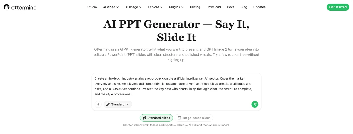
A real capture of Ottermind's AI PPT page in this checkout (local development build, November 16, 2026): the prompt field, the send action and the switch between standard and image-based slides. The template strip further down that page loads separately, and it rendered empty in our capture, so the eight deck styles are described in the text rather than shown — the count comes from the page's own preset list, not from this screenshot.
Where to make one
Ottermind has two entries, and they cover different halves of this job.
- AI PPT generator — start from the task rather than the picture. Describe the deck, or drop in a document or a link, and Ottermind builds the pages as one connected system: matching layouts, type and image treatment across the deck, with the deck downloadable as PowerPoint slides you can keep working in. This is the right entry when the background needs to be consistent for twenty pages, because the consistency is decided by the deck rather than by you pasting sixteen files.
- Presentation templates — start from a look. Eight styles, five slide previews each, inspectable before you choose; you pick a style and describe your subject, and the deck is generated in that visual language, then continued in Studio.
The composer at the top of this page stages the brief from step 1 and hands it to Studio. Filling it and sending it are separate actions, and nothing is generated until you continue — which is also the honest description of what a background prompt can do on its own: it gives you a file to judge, not a finished deck.
Related reading
- Best AI presentation makers — the tool comparison to read before you decide where the deck gets built.
- How to use Claude to make presentations — the same job approached from a document-first workflow.
- How to create a product presentation with AI — what changes when the slides have to sell something specific.
- How to generate a presentation with AI — the end-to-end walkthrough, including the parts a background cannot fix.
- 10 AI hero image prompts for products and marketing — the same "name the lens, the light and the empty space" discipline, applied to images that carry the message instead of sitting behind it.
- White background: how to get a clean cutout — the extreme case of this article, where the background is meant to disappear completely.
Questions that come up
What size should a slide background be?
Match the slide's aspect ratio and then go up one step for headroom. A widescreen slide is 13.333 in × 7.5 in (16:9); at 96 pixels per inch that is 1,280 × 720 px, and at 150 ppi it is 2,000 × 1,125 px. Generating at 1,536 × 864 or 1,920 × 1,080 leaves room to crop without upscaling. A 4:3 slide is 10 in × 7.5 in, so a 4:3 image is the correct frame there — do not stretch a 16:9 file into it.
Light or dark background?
Whichever your text can survive and your room can show. Dark backgrounds read well in a darkened room and poorly in a bright one; light backgrounds do the opposite and are usually better for printing. The decision is the contrast measurement in the band, not a mood.
How do I apply one background to every slide?
In PowerPoint: Design → Background Styles → Format Background, choose a picture or texture fill, insert the image, then choose Apply to All. To remove it, use Reset Background and Apply to All. Note that PowerPoint for the web supports solid colour and picture backgrounds but not gradient fills for slide backgrounds, so a gradient background cannot be fully edited there.
Can I use an AI image inside my existing template?
Yes, as a picture fill on the slides you choose — the image does not need to come from the template. What it will not do is inherit the template's palette, spacing or type, so treat it as an imported photograph and check the band again after it lands.
Why does my background look fine on my monitor and bad on a projector?
Projected images lose contrast before they lose colour, so a band that measures 4.5:1 in a bright monitor often reads as grey in a lit room. Banding appears for the opposite reason: a gradient with many small steps gets compressed and shows rings. Fewer tonal steps and a higher floor fix both — but the only real check is your deck on the actual projector, which we did not have.
Is a generated background safe to use commercially?
That depends on the terms of the account and model you used and on your jurisdiction, and it is not something this page can decide for you. Treat the image as a licensed asset you must verify, keep a record of how it was made, and do not assume a generated picture is free of third-party rights simply because a model produced it.
A background earns its place by being forgettable in the right way. Set the slide size, put the real words on it, measure the band once, and keep the brief that produced it — that is the difference between a file you happened to like and a background you can repeat.