Prompt Guidance
White Background: Five Briefs and the Checks That Prove It
A white background is a measured result, not a colour word. Start from the product photo you already have, write the brief that controls one variable, and continue in Ottermind Studio — filling and sending stay separate actions.
Optional
JPG / PNG / WebP
This is Ottermind's composer. Filling the brief and sending are separate steps, and it does not spend another product's credits or promise a pure 255/255/255 background.
November 12, 2026 · 12 min read
A white background is a backdrop that reads as neutral white at the pixel level — not a phrase you add to a prompt and assume you received. The job is narrower than the search term suggests: one subject, one even field behind it, edges that still describe the subject, and a file that survives the crop and compression the destination applies afterwards.
Use it when the image has to sit in a grid and be compared with its neighbours: a product listing, a catalogue row, a headshot, a cutout that will be composited somewhere else later. Do not use it when the setting is part of the argument — a lamp photographed on white stops showing how it lights a room, and a jacket on white stops showing how it falls when worn outdoors.
What this guide is based on: Ottermind's AI Product Image Generator, AI Photo Editor, Background Remover, GIF Background Remover and AI Image Resizer pages were read for this article on November 12, 2026. The framing, size and file rules attributed to Google Merchant Center come from its Image link [image_link] specification, read the same day. Numbers labelled as this guide's own are editorial thresholds, not quoted policy. The cover and the comparison images were generated with an image model for this article; the screenshot is a real screenshot of this page. No image here is a marketplace screenshot, a platform compliance verdict, or a guarantee of how a channel will review your file.
Four things people mean by "white background"
The phrase covers a solid fill, a physical backdrop, a white scene, and a cutout sitting on white. They fail in different places, so decide which one you are buying before you write the brief.
| You mean | What it actually is | Where it usually fails |
|---|---|---|
| Solid fill | A flat colour placed behind a cutout subject | Edges: a 1–3 px grey fringe left over from the old background |
| Seamless backdrop | A real paper or fabric sweep, lit in a studio | Gradient: the sweep is never perfectly even, and corners go grey |
| White scene | A styled set that happens to be white — table, wall, sky | Context: props and shadows return, and the frame stops being neutral |
| Cutout on white | A subject on an opaque white page, exported flat | Contrast: a white shirt or a white bottle disappears into the field |
For product listings the first two are what most channels mean; for retouching and composites the fourth is usually the honest description of what you need.
What "white" has to mean in measurable terms
"It looks white" is a judgement made on one screen at one brightness. The check below is the same judgement made with numbers, so you can compare two candidates, or two revisions of one candidate, without arguing about taste.
| Check | How to measure it | Pass |
|---|---|---|
| Neutrality | Read a 50 × 50 px sample in each corner, outside the subject | Mean R, G and B all ≥ 249, and within 3 levels of each other |
| Evenness | Compare those four corner samples | Brightest corner minus darkest corner ≤ 4 levels |
| Edge | View the busiest edge at 200%: hair, a strap, a handle opening, a glass rim | Transition band ≤ 2 px, no grey or coloured fringe, no melted segment |
| Contact | Look where the base meets the surface | Shadow touches the base, spans no more than roughly 110% of the base width, and no grey reaches the corners |
| Framing | Bounding box of the subject against the frame | The product fills 75–90% of the image, per Google Merchant Center |
| Size | File properties | At least 500 × 500 px, rising to that minimum for all products from January 31, 2027; 1,500 px on the long side or more is what Merchant Center recommends |
The last two rows are quoted from a published specification; Google's page also forbids overlays, watermarks, borders, barcodes and single-colour images, and caps files at 16 MB. The first four rows are this guide's thresholds. They are deliberately tighter than "visible on my screen", because a 3-level cast that is invisible in a 2,000 px preview becomes a grey band after a channel crops, downsamples and re-compresses the file.
Two conclusions follow from that table, and both are more useful than a prompt.
First, white is not a colour you can verify by looking. Sample it. Second, white is not a universal requirement: the Merchant Center specification above spends its requirements on framing, overlays and file format, and says nothing that makes a white backdrop mandatory. Check the current rule for the channel you are selling on, and for apparel, multi-packs, 3D renders and packaging the exceptions are worth reading before you standardise a whole catalogue on white.
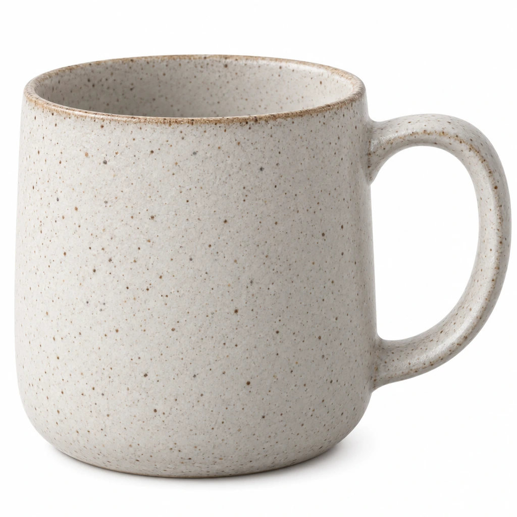
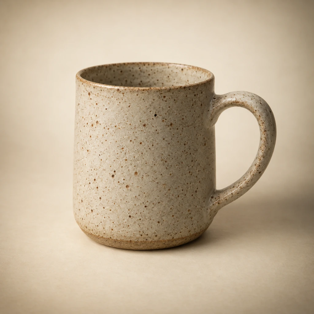
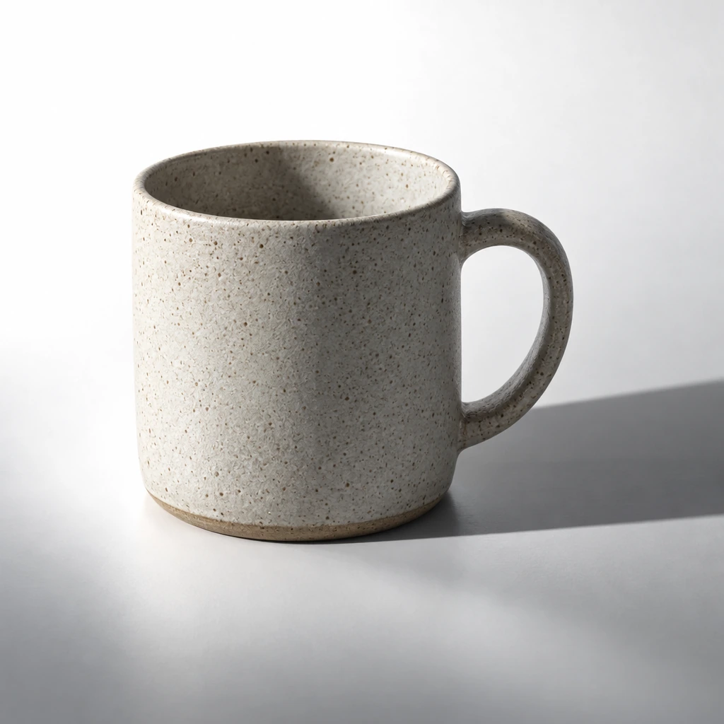
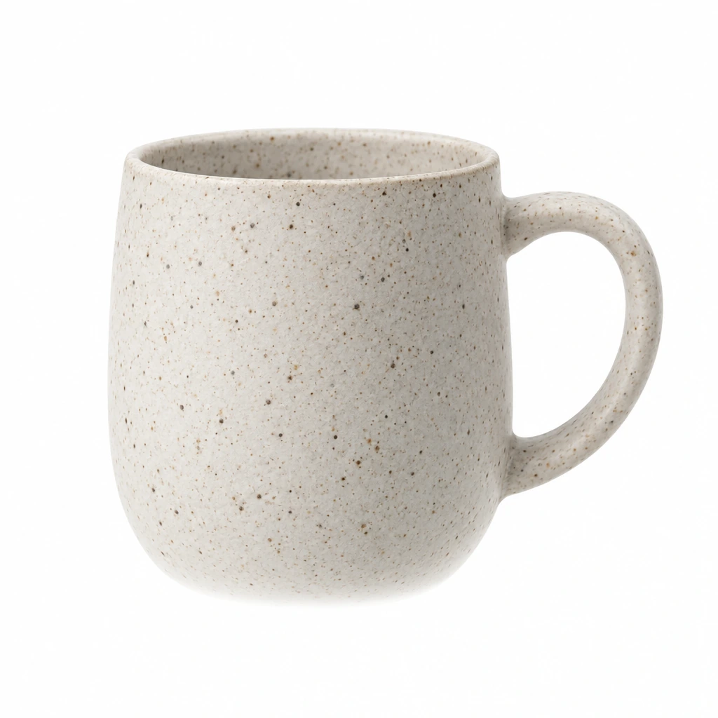
Four renders of one brief, generated for this article. Only the background sentence changed. Top left — "even background, one contact shadow": corners measure 254/254/254 with a spread of 0. Top right — "warm cream backdrop with a soft vignette": corners drop to 136–170 and the red-to-blue gap inside each sample reaches 52, which is the cast the eye reads as "not quite white". Bottom left — "long hard shadow across the surface": one corner measures 134 against 254 at the brightest, a 120-level spread. Bottom right — "shadow removed entirely": the corners are perfect, and the mug no longer touches anything, so it fails the contact check while passing the numbers. That last pair is the point of testing two things at once. All four are illustrative generations, not marketplace submissions.
Three routes from the photo you already have
Most people arrive with a photo, not with a blank canvas. Which route fits depends on what you need to be true afterwards.
| You have | Route | What it gives you | What it does not |
|---|---|---|---|
| A usable photo with a busy, coloured or wrong background | Generate a new scene with the product as the reference — AI Product Image Generator | A new setting, light and background you can direct in words | A pixel guarantee: the tool's own page states it does not guarantee that every version preserves every product detail |
| A subject you can isolate, and white that must be provable | Separate the subject, then fill the background — Background Remover | Solid background controls, including white, black, two pale presets and a custom colour picker | New detail: the cutout cannot invent the part of the product the original hid |
| An image that is almost right — 5% off, one leftover prop, a cast | Repair the existing file — AI Photo Editor | Background cleanup, scene replacement, lighting balance and shadow work with the product locked | A guarantee that the edges stay untouched; compare them at 200% |
| An animated GIF | GIF Background Remover | Subject kept across the loop, on a replacement background | Smooth alpha: GIF stores one transparent index, so soft edges matte |
| A finished image that needs exact pixels | AI Image Resizer | Exact width and height with the aspect ratio locked | Detail: enlarging estimates pixels, which softens fine print |
The first route is the one that produces the most convincing images and the least provable ones. A generative pass reinterprets: it may straighten a curve, clean up a scuff, or re-set a label it found hard to read. That is why the tool page puts an accuracy check after generation rather than a promise before it — compare geometry, material, label and reflections with the real item before the image goes anywhere near a listing.
The second route is the one to use when "white" has to be a fact rather than a look. Because the fill is a chosen colour rather than a rendered one, it holds after compression. The catch is the edge: a PNG extension does not prove transparency — place the cutout over white yourself, look at the fringe at 200%, and export a flat file if the destination wants an opaque image.
The third route is underused. If the photograph is already 95% right, regenerating the whole image to fix a grey corner risks the product; an edit that says "keep everything, replace the backdrop, remove the shadow of the chair leg" keeps more of what you approved.
Five briefs, one variable each
Each brief below changes a single property of the picture. Run them one at a time against the same source so you can tell which instruction did the work. The composer on this page sends a prompt and one optional reference image; it has no ratio or background-colour control, so both belong in the sentence.
1. Evenness: one flat field, corner to corner
Place this exact product on a seamless neutral white background. Light it with one large soft source from the front-left so the background reads as a single even white from corner to corner: no gradient, no vignette, no visible horizon line and no colour cast. Keep the product's shape, proportions, material, colour and any label exactly as in the reference. Square 1:1 frame, product filling about 85% of the frame, equal margins. One short soft contact shadow directly under the base only. Nothing else in the frame, no text, no props.This controls illumination falloff. Judge it by the four corner samples, not by the centre: the middle of a gradient still reads white.
2. Contact: grounding without a grey puddle
Keep the product on the same flat white background, but ground it: one soft contact shadow that starts at the base, spreads to about 110% of the base width, fades to white at its edge, and stays neutral grey rather than brown or blue. No second shadow, no cast shadow running to the frame edge, and no reflection. The background must stay white above the shadow and in all four corners. Do not change the product itself.This controls the shadow, the single most common reason a correct white background still looks pasted. A shadow that does not touch the base is the second most common.
3. Specular products: metal, glass, gloss
Photograph this product on a neutral white background as a studio still life. It is a brushed-metal body with a glass window and a glossy plastic panel, so keep the reflections honest: a clean vertical highlight on the metal, a soft gradient inside the glass, and a crisp edge where the gloss turns. Do not blur or smear reflections, do not invent a reflection of the studio, and do not tint the white. A short soft reflection of the base may appear on the surface below it, fading out within a few centimetres. Equal margins, subject filling about 85% of the frame.This controls how the model treats specular surfaces, which are where "white background" turns grey: the model mirrors the environment it thinks the object is in, and if nothing names that environment it invents a dim one.
4. White on white: keeping the edge
Place this model in a white cotton shirt on a pure white background, and keep the silhouette readable. Preserve soft shading across the fabric, a faint contact shadow at the shoulder and along the arm, the crisp edge of the collar and cuff, and individual hair strands against the white. Skin tone, expression and identity must stay unchanged. Do not flatten the shirt into the background with frontal light, and do not add a grey outline or a glow to fake separation. Three-quarter frame from the chest up.This controls separation. White-on-white fails not because the background is wrong but because the subject has no shading left; the fix is light and shadow on the subject, not a darker background.
5. Reserved space: white that has to stay empty
Photograph this product on the left third of a wide neutral white surface, straight on at product level. Large soft light from the upper left, one short contact shadow under the base. The right two thirds of the frame must stay completely empty white: no shadow, no texture, no gradient and no props, so text can be placed there later. Do not add any text or logo. Keep the product's label and proportions unchanged.This controls negative space and the crop-safety margin. Check it by drawing the future text block over the image before you approve it — art directors reject the empty area far more often than the product.
The button fills brief 1 into the composer at the top of this page. It only fills; sending is a separate action, and nothing is generated until you continue in Studio.
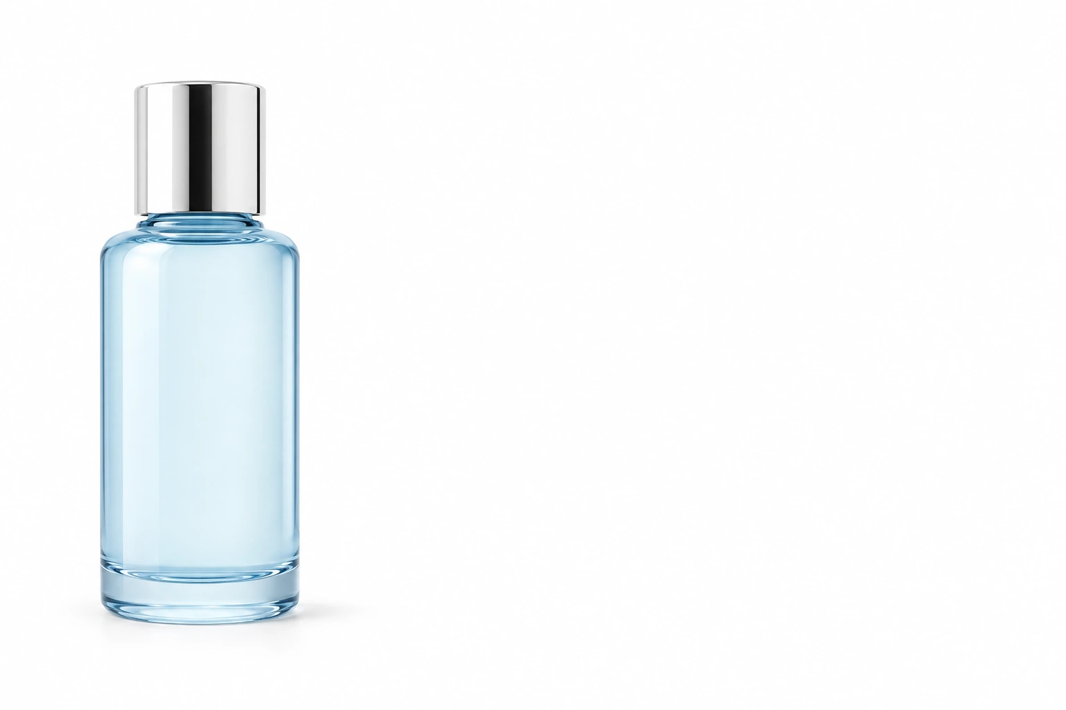
Brief 5, generated for this article: product on the left, the right two thirds reserved. The reserved area measures 254/254/254 with no shadow and no gradient. The test that matters is not the white — it is whether the text block you plan to place there actually fits before you approve the image.
Where it goes wrong
Nine failures account for most rejected white-background images. Six of them are generation artefacts, and each has a fix that is cheaper than starting again.
| What you see | Why it happens | Fix |
|---|---|---|
| Cream, ivory or blue-white instead of neutral white | The model reproduces the colour temperature of the studio it learned, or copies the source photo's cast | Name neutrality in the brief: "neutral white, no warm or cool tint", then sample the corners |
| Grey corners, a dark halo around the frame | A vignette was treated as photographic realism | Ask for "even illumination, no vignette, no falloff", and check all four corners, not the centre |
| A grey or coloured fringe at 1–3 px | The edge was blended with the original background | Change route: cut out instead of regenerating, then place the subject on a solid white fill |
| Hair, fur or thin straps dissolve | Low contrast between subject and source background | Raise the source contrast, or cut out and keep the alpha edge |
| The product quietly changed: label, logo, proportions, hardware | The model reinterprets detail it cannot read | Compare against the source at 200%; for a background-only change, use the editor route instead |
| An invented prop, a duplicate item, or a second shadow | The brief left the scene open | Close it: "nothing else in the frame", "one object only", "no reflection" |
| The subject floats | The shadow was removed and nothing replaced it | Ask for one contact shadow, then verify it touches the base |
| A white product disappears into a white field | No tonal separation between product and background | Keep a shadow line under the base, let the product's own shadow side read, or accept a pale grey→white gradient |
| Lettering appears in the image — a price, a badge, a watermark | Text was requested, or the model filled empty space | Remove text from the brief; add real type in a layout tool where it can be edited and checked |


Two attempts at the same job, generated for this article. Left: the corners measure 251–253 — inside the pass band — and the t-shirt still dissolves into the field, because nothing separates subject from background. Right: the edge reads at normal size and at 200%, and the bottom-right corner sample is invalid here (191/188/192) because the sleeve occupies it, which is the other half of the lesson: sample outside the subject, or the measurement lies in your favour.
White background vs transparent background
These two get used as synonyms in the same sentence, and they are not the same deliverable.
| White background | Transparent background | |
|---|---|---|
| What the file stores | Colour values in every pixel | An alpha channel plus colour, where the subject sits |
| What the viewer sees | White, always, in every app | Whatever sits behind it — white, cream, a photo, a dark website |
| Where it fails | Corners, gradients, edges that no longer separate | Anything that assumed an image can have holes: JPG, some feeds, some print pipelines |
| Best for | Listings, catalogues, headshots, anything judged in a grid | Composites, product pages with coloured themes, layered design work |
| How to check it | Sample the four corners | Place the file over three backgrounds, including a dark one |
Two practical notes. A PNG extension is not evidence of transparency — the format can hold it, the file may not. And a transparent background is not automatically better: if the destination is white, an opaque white file is more predictable than an alpha edge that will be composited by software you do not control. Animated GIF is a third case: it stores one transparent index rather than smooth alpha, so soft shadows and wispy edges matte, which is exactly why that workflow has its own page.
Before you export
Five checks, in this order, on the final file rather than on the draft:
- Sample the four corners. All ≥ 249, spread ≤ 4, channels within 3 of each other.
- Look at the busiest edge at 200%. Clean transition, no fringe, no merged segment.
- Check contact. The shadow touches the base and stops well before the corners.
- Measure framing and size against the destination's current rule: 75–90% fill, and at least 1,500 px on the long side for a listing.
- Confirm the file itself. Format matches extension, no overlay text, no border, no watermark, and a size your channel accepts.
If the image is a still that will later move, the same file is the right starting point for a motion brief — see image-to-video prompt patterns — but keep the approved still as the reference rather than a re-generated one.
From check to tool
The three product routes above are the ones this site actually runs, and each starts with a brief rather than a template.
- AI Product Image Generator — upload a product photo, describe the background, light and shadow, and review the result against the source. This is the route for "I have a photo, I need a new setting".
- Background Remover — separate the subject and choose a solid background, including white. This is the route when white must be exact and provable, and the edge matters more than a new scene.
- AI Photo Editor — keep the image and fix the background, the cast or the leftovers. This is the route when regenerating risks the product.
If you need the background to earn its keep rather than merely be white — a catalogue direction, a set, a mood — start with the product image prompt patterns, which cover lighting and scene writing rather than the neutrality checks above. And if the image is going to be printed or posted rather than listed, the poster checks catch the crop and typography problems that a white background will not.
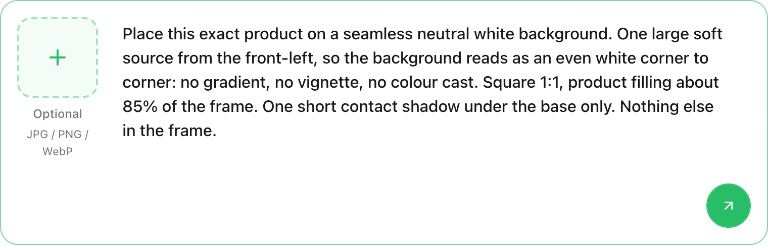
The composer on this page after typing the opening of brief 1. This is request preparation, not a generated image: the field holds text, the attachment slot is empty, and sending is the separate action that continues the brief into Studio. A longer brief scrolls inside the field.
Questions worth answering
Is "white background" the same as a white studio backdrop?
No. A backdrop is a physical sweep with falloff, texture and a horizon; a white background as a deliverable is a measured field behind a subject. The backdrop is how you make one by hand; the field is what the channel checks.
Can an AI generator produce a pure white background?
It can produce something that measures as white, and it can also produce cream, grey or a gradient while looking white in a small preview. There is no setting on this site that promises 255/255/255 output, so the reliable answer is procedural: brief for neutrality, then sample the corners and, if the number matters more than the scene, use a cutout with a solid white fill.
Why did my white background come out grey?
Usually one of three reasons: a vignette the model added as realism, a cast inherited from the source photo, or compression after export. Check the corners of the file you are about to upload, not the preview in the generator.
Should I upload a PNG or a JPG?
For an opaque white background, a high-quality JPG is smaller and predictable. A PNG is worth it only when you actually need transparency, and then make sure the transparency survived — place it over a dark background to confirm.
Does a white background guarantee my listing will be accepted?
No. White is one property among several: framing, overlays, text, borders, watermarks, file format and size all get checked separately, and the rules differ by channel and category. The specification linked at the top of this page is a better guide than any checklist that stops at "make it white".
A white background is one of the few image jobs where the result can be verified rather than debated. Write the brief for one variable, sample the corners, look at the edge at 200%, and keep the source next to the output until the file has passed — that sequence is what turns a white backdrop into a white background you can defend.