Prompt Guidance
Poster Ideas: 30 Directions and How to Choose One
Poster ideas only help once you know what the poster has to do. Pick a direction from the thirty below, write the brief, and take it into Ottermind Studio — with an optional reference image, and no generated poster until you continue there.
Optional
JPG / PNG / WebP
This is Ottermind's composer. Filling the brief and sending are separate actions, and it does not open Dreamina or spend another product's credits.
November 10, 2026 · 11 min read
A poster idea is a decision about what the reader should do first. Most idea lists answer "what looks good". The harder question is which direction fits the job in front of you: one date, one offer, one explanation, or one invitation to take part.
This page sorts 30 directions by that job, gives you a six-slot brief that works in any generator, and lists the checks that catch a weak idea before it reaches a printer or a feed. It is written for the person with one poster to make this week — a small team, a teacher, an organiser, a designer starting from zero — not for a brand team that already has approved templates.
How this guide was prepared: Official pages were checked on November 10, 2026: Dreamina's poster ideas resource page (published October 24, 2026), Ottermind's AI Poster Generator, AI Banner Generator and AI Flyer Generator pages, and VistaPrint's standard poster size guide for print sizes, bleed and resolution. This is a workflow guide built from published pages, not a speed or quality test. The cover and the six direction visuals were generated with an image model for this article; the crop diagram uses one example published on Ottermind's poster page. None of them is a product screenshot or a guaranteed output. The composer figure is a real screenshot of this page, and no generation was run inside Ottermind for this article.
Start with the job, not the style
Five jobs cover most posters. Name yours before you look at a single reference, because the job decides the reading order, the amount of text, and what the reader is asked to do.
| The job | What the poster must do, and decide first | The usual failure |
|---|---|---|
| Announce | Give one date, one place, one reason to come; decide whether the date, the act or the place is the news | A beautiful image with an unreadable date |
| Sell | Make one offer and one price clear; decide the one claim you can support | Three offers competing in one frame |
| Explain | Leave the reader with one idea they can repeat; decide the sentence you want quoted back | Dense text nobody reads from across a room |
| Set a mood | Give a film, gig, exhibition or season a visual world; decide which reference world you are borrowing | Atmosphere with no title, date or venue |
| Recruit | Turn a passer-by into a participant or supporter; decide the exact next action | A call to action buried in the bottom corner |
The same subject changes with the job. A photograph of a mug can sell a product, announce a workshop, explain a glazing process, or set the mood for a film. What changes is the reading order: which line is largest, what the reader is asked to do, and what you are willing to remove.
That is also where the page already ranking for this query stops. Dreamina's poster ideas resource (checked November 10, 2026) lists 15 design techniques, each with a one-line prompt, then a three-step tour of its own image generator with model, aspect-ratio and resolution settings. It is a useful catalogue of techniques and a clear product tour. It does not help you choose between the techniques, and it does not say what to check before printing or publishing. Those are the two jobs this page adds.
Thirty poster ideas, sorted by the job
Each row is a direction, not a template. The third column is the phrase to put in your brief so the result can be judged against your intent instead of a vague idea of "professional". Swap the subject; keep the structural instruction.
If the poster has to announce something
| Direction | Use it when | The line to put in the brief |
|---|---|---|
| Date-first typography | The date is the news: one night, one deadline | Make Saturday 14 March the largest element; headline second; venue and time in one small line |
| Lineup grid | Several acts, speakers or vendors share the bill | Set the names in an even grid, one line each, headliner at twice the size, no invented portraits |
| One-object save-the-date | The venue is the draw and the programme is still open | Photograph the empty hall from the doorway, put the date in the top third, keep the rest calm |
| Route or site map | The event spans several streets, rooms or studios | Draw a simple street map with the venue marked, one accent colour for the walking route, no decorative detail |
| Session or price tiers | The same event runs at different times or prices | Split the lower half into three equal columns for times and prices; keep one headline across all three |
| Poster as invitation | The reader has to reply, register or RSVP | Give the reply details their own bottom panel, with the deadline in words and a real QR code added later |
If it has to sell
| Direction | Use it when | The line to put in the brief |
|---|---|---|
| Seamless-sweep hero | One product has to look considered, not busy | One object on a seamless paper sweep, side light from the left, one claim above it, no props |
| Price lockup | The number is the reason to act | Make the price the largest element, keep the product small but exact, put the conditions in one line beneath |
| Documented before and after | The change is visible and you can show both states | Same crop and same light before and after, label both states, do not retouch the after into a different object |
| Exploded or component view | What is inside is the selling point | Arrange the parts in a loose grid around the product at true relative scale, no invented extras |
| In-context scale | Size, fit or placement is the question | Put the product in a real room with a familiar object for scale, camera at eye level, no showroom gloss |
| Quote card | One customer sentence explains the value better than a claim | Set one short quote at reading size, attribute it with permission, keep the product small in one corner |
If it has to explain
| Direction | Use it when | The line to put in the brief |
|---|---|---|
| One big number | A single statistic carries the argument | Make the number dominant, name the measure in one line, put the source and year in small type |
| Numbered steps | The reader has to do something in order | Number three to five steps, one icon each, eight words maximum per step |
| Annotated diagram | The parts or layers need names | Draw the subject in section, add five horizontal callout labels, keep every label outside the subject |
| Myth and fact | A common belief is the obstacle | Two columns, one myth per row with its correction opposite, a visible divider, no more than five rows |
| Timeline | Sequence and duration are the message | One horizontal axis, evenly spaced dates, one sentence per event, seven stops maximum |
| Glossary grid | The audience needs vocabulary before the argument | Six to nine terms in equal tiles, term above a one-line definition, alphabetical order |
If it has to set a mood
| Direction | Use it when | The line to put in the brief |
|---|---|---|
| Oversized type crop | A photograph already carries the mood | Crop the photograph tight, let the headline cross the top edge, keep faces clear of the lettering |
| Duotone or riso texture | The poster should feel printed rather than photographic | Two inks only, visible grain, slight misregistration, no gradients |
| Cut-out collage | The idea is assembled rather than photographed | Halftone cut-outs on flat colour, torn edges, one deliberate scale jump, a single line of type |
| Hand-lettered headline | The tone is personal, local or playful | Draw the headline by hand, repeat the phrase in a plain second line for legibility, check every letter |
| Negative-space silhouette | One shape can hold the whole story | Build the scene inside the silhouette of the object, flat colour outside, readable at thumbnail size |
| Archival reproduction | The poster should look found, documentary or historic | Aged paper, letterpress type, a fold or stamp mark, real dates and sources only |
If it has to recruit
| Direction | Use it when | The line to put in the brief |
|---|---|---|
| Portrait grid | The people are the reason to come or join | A grid of six portraits in the same crop and light, one name each, written consent on file |
| Quote wall | Many voices make the case better than one | Twelve short lines in a staggered grid, first name and role only, no invented quotes |
| Pledge or checklist | You want a commitment, not just attention | Five actions with empty boxes, a headline that states the ask, one logo at most |
| Participant map | The value is spread across places | Map the venues as numbered markers, a key in one corner, the dates in the headline |
| Then and now | Change over time is the point | Two matched views with the same framing, years labelled, one sentence explaining what changed |
| Single symbolic object | The issue is hard to photograph directly | One object on a plain ground, hard light, a short caption that states the ask, nothing else |
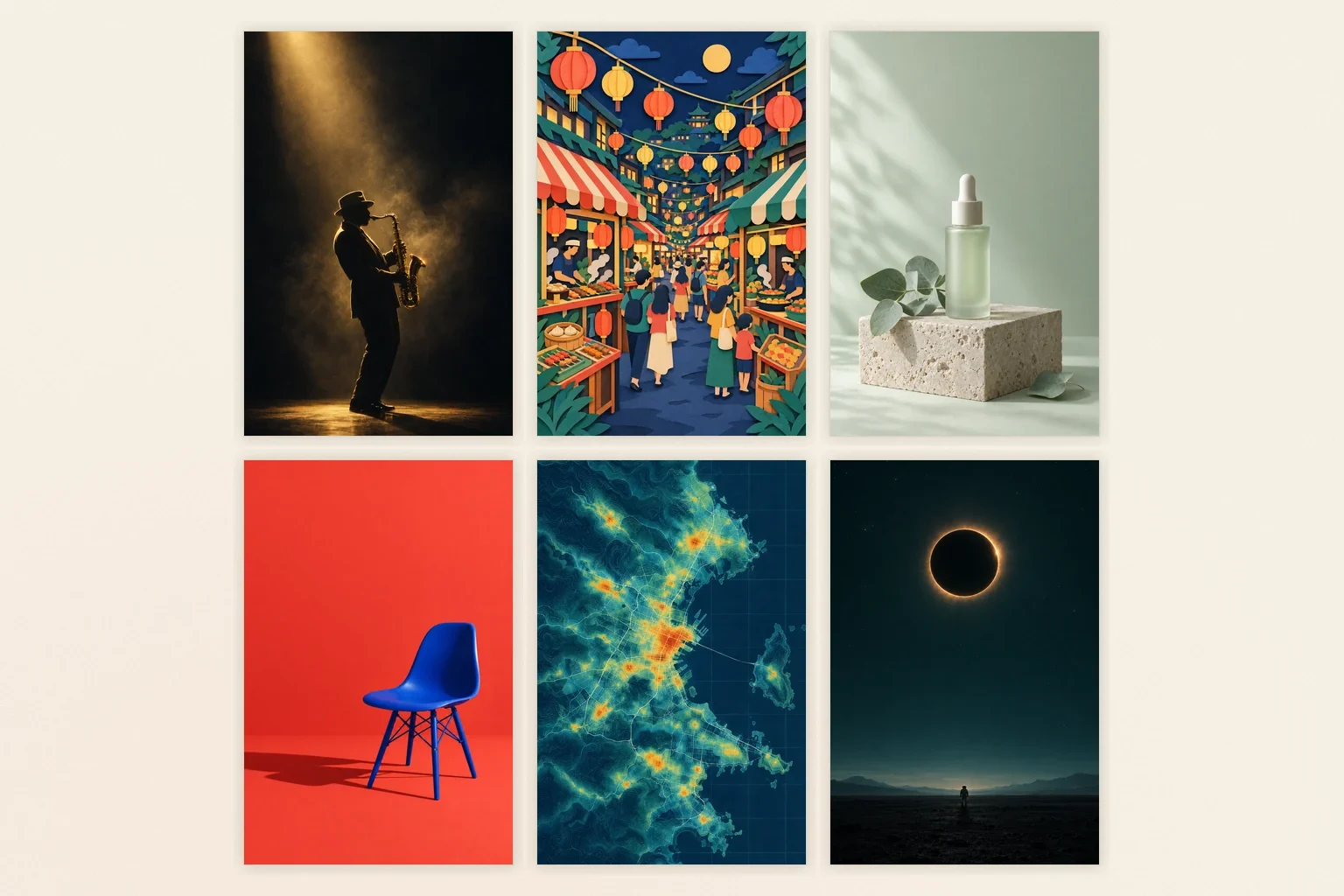
Six visual systems with the lettering removed, so image, palette and composition are the only variables: cinematic photography, paper-cut illustration, editorial product styling, a colour-blocked studio set, data-led artwork and atmospheric science fiction. Concept artwork generated for this article with an image model; it is not a screenshot, a published example, or a guaranteed output.
A direction is not a style. "Minimal" is a style; "one big number, named measure, small source line" is a direction you can brief, generate, and reject. The more of the direction you can state as a decision, the less the generator has to guess.
Write the brief in six slots
A brief that produces a usable poster answers six things in this order. Leave a slot empty and the model fills it with an average choice.
| Slot | What to write | If it stays empty |
|---|---|---|
| Audience | Who is standing in front of it, and what they already know | The tone and reading level default to something generic |
| Job | Announce, sell, explain, set a mood, or recruit — one only | The poster tries to do two jobs and does neither |
| Exact headline | The words that must appear, spelled as they must appear | The generator invents a title and the exactness is lost |
| Required facts | Date, time, venue, price, room, URL, deadline, source | Details turn into decorative texture instead of information |
| Action and destination | What the reader does next; print, feed, story or banner | The call to action fits no real placement |
| Visual system | Subject, composition, palette, type character, and the space that must stay empty | Style is chosen by the model, not by you |
Two habits keep the rest of the brief from undoing the first five. Put the information order in words ("headline first, date second, venue third"), and reserve space explicitly ("leave the bottom tenth clear for a sticker") instead of asking for "balanced composition". A generator can follow a stated order far more reliably than it can infer one.
Three briefs you can run
These are complete briefs, not prompt snippets. Each states the job, keeps the exact wording separate from the visual choices, and names the space that must stay empty.
Design a portrait A3 event poster for a neighbourhood repair café on Saturday 14 March, 10:00–16:00 at Riverside Community Hall. The headline is REPAIR CAFÉ and must be spelled exactly. Show a flat-illustration workbench with a toaster, a lamp and a bicycle wheel in mustard, deep green and cream. Put the date and venue in a clear second tier, and one line at the bottom: Bring one broken thing. Free to attend. Keep the margins generous, leave the bottom tenth clear for a venue sticker, and add no other text.Design a square product poster for a small ceramics studio's spring sale. One stoneware mug on a linen surface, soft side light from the left, a deep shadow, cream and clay palette. Headline SPRING SALE, then 20% OFF ALL MUGS in a smaller tier, then the dates 4–12 April and the studio address. The mug shape and glaze must stay exactly as described. Add no extra lettering and no decorative badges, and keep the top-left corner quiet for the studio logo.Design a portrait research poster for a public library lecture on urban heat. One large headline: WHY SOME STREETS ARE HOTTER, then three numbered findings, each with a short label and one simple line icon. Show a section drawing of a street with trees, asphalt and shade as the main image. Palette: deep blue, warm grey, one coral accent. Leave a 3 cm margin, keep each finding to three short lines, and put the lecture date and room at the bottom in a single line.The button fills the first brief into the composer at the top of this page. It only fills; nothing is sent, and nothing is generated until you continue in Studio. That separation matters when a brief is long, because you can correct the wording before spending a generation on it.
A reference image is optional, and it changes what the brief means. A product photo says "keep this object"; a palette card says "keep these colours"; a layout sketch says "keep this structure". Ottermind's AI Poster Generator accepts a permitted visual reference, and the brief should identify whether it supplies the subject, colour direction, layout or mood. Upload only material you have the right to use. A competitor's poster is a mood reference at best, not a template you can reproduce.
Six checks before you produce it
A poster idea is only good if it survives being looked at the way it will actually be seen. Run these six checks on the draft, not on your intention.
| Check | How to run it | Fail signal |
|---|---|---|
| Arm's-length read | Hold the phone at arm's length, or look at a proof across the desk | You describe the picture but cannot say what the event is |
| Thumbnail test | Shrink the draft to about 200 px wide, the size of a feed card | The headline disappears and the details turn into texture |
| Distance test | Step back to the distance the poster will be read from | You are squinting, or the type is only legible up close |
| Exact-copy read | Read every character aloud against the source: date, time, price, venue, URL | A plausible but wrong digit, or a letter the model invented |
| One-message test | Ask someone uninvolved to repeat the message in one sentence | Their summary is not your summary |
| Placement test | Put the draft into the real frame before approval | The headline sits outside the crop, or under a platform control |
The placement check catches the most expensive mistake, because a portrait poster is not a banner. A centre crop of a 3:4 poster into 16:9 removes the top and bottom of the composition, and on a typographic poster that is exactly where the headline lives.
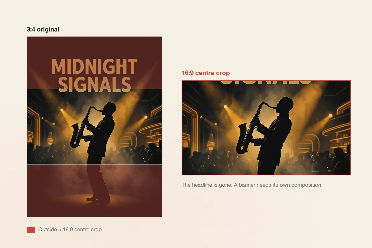
One published example concept, two frames. The red bands show what a 16:9 centre crop takes away; the crop on the right loses the headline and the standing figure's feet. The fix is a separate wide composition with the same subject and palette, not a better crop. Figure assembled for this article from the example published on Ottermind's poster page; it is not a recommended output.
From direction to file
The sequence below is short on purpose. Most weak posters are not a generation problem; they are a decision problem that was handed to a generator.
1. Choose one direction and one job. Write the six slots. If you cannot fill slot three with the exact words, stop here — you do not have a poster idea yet.
2. Prepare a permitted reference, or none. A product photo, a palette card, a venue photo, or a rough layout sketch all work. Say what the reference controls. For a product-led poster, a clean photo matters more than a longer prompt.
3. Generate a small set and compare one variable at a time. Three to five directions with the same message and different visual systems is a comparison; ten variations of the same idea is a slot machine. Judge at full size and again as a thumbnail.
4. Recompose for the next placement. A feed crop, a story frame and a banner need their own type sizes and safe areas. Ottermind's AI Banner Generator takes the offer, the destination size and an optional logo or product photo; the AI Flyer Generator covers a handed-out sheet with its own message hierarchy. If the poster is one piece of a campaign, Graphic Design AI is the better starting point than repeating the same prompt six times.
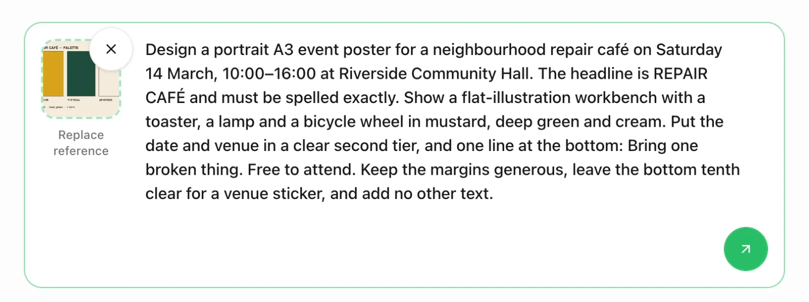
The composer on this page after filling the repair café brief and attaching a palette card as a reference. This is request preparation, not a generated poster: the screenshot shows the text and attachment staged, and sending only continues the brief into Studio.
Print sizes, bleed, and resolution
Print decisions are where a digital draft stops being enough. VistaPrint's poster size guide (checked November 10, 2026) lists eight print sizes and the production rules below. The table adapts that range to the jobs in this article and adds the screen formats that usually follow a poster. Check your own printer's specification before you export, because requirements differ by supplier and finish.
| Format | Typical size | What changes in the design |
|---|---|---|
| Letter handout | 8.5 × 11 in | Read up close; more detail is allowed than on a wall poster |
| Small poster | 11 × 17 in | Hallway or door; the guide suggests this size when the message is short |
| Standard event poster | 18 × 24 in | The guide calls this one of the most common sizes and suggests strong focal points; it suits detailed images and event graphics |
| Large poster | 24 × 36 in | Window, exterior or trade show; the guide pitches maximum visibility and says to avoid intricate detail |
| Very large | 36 × 48 in | Distance viewing; the guide recommends oversized visuals, clear readable text, and simplicity |
| Feed post | 4:5 | Judged as a thumbnail first; keep type inside the safe area |
| Story or reel | 9:16 | Keep lettering out of the top and bottom interface zones |
| Screen or banner | 16:9 | Needs its own composition, not a crop of the portrait artwork |
Two production numbers are worth planning for from the start. The same guide states that print files need crop marks and a bleed margin of at least 0.125 inches beyond the design size — an 8.5 × 11 in poster is prepared at 8.625 × 11.125 in — and that 300 PPI is the standard print resolution, though large posters viewed from a distance can sometimes use less. Those rules apply to the file you send to a printer, not to the image a generator returns, which is why the preflight step is not optional.
What an AI poster still cannot finish
The features are real; the finished artwork is not automatic. Ottermind's own tool pages are explicit about the boundaries, and they are worth repeating here.
- Lettering. Generated images can contain misspelled, malformed, or invented lettering. Read every character, number, date, price and disclaimer against the source. Critical wording belongs in an appropriate layout workflow, not in a hopeful prompt.
- Logos and marks. A reference guides a draft; it does not guarantee a match. Place the real logo file in production instead of tracing a generated approximation.
- QR codes. Generate the code separately and place it in an editor. A visually plausible generated code is not a working link.
- Rights. Use references you have the right to use, and get permission for identifiable people, private places and other brands' products. Platform advertising policies differ by placement; check the current policy for where you plan to run it. None of this is a legal conclusion, and this page gives none.
- Production. An AI output is a draft. Confirm dimensions, resolution, bleed, safe area, colour, accessibility and file requirements with the printer or platform before release.
If the poster needs a logo direction, the logo prompt patterns are a better starting point than asking a poster prompt to invent a mark. If the draft is nearly right and only the words need to change, the Image Text Editor is safer than regenerating the whole composition.
Poster questions worth answering
What makes a poster idea good rather than just attractive?
It survives the six checks. A good direction states a job, a message and a reading order that still work at thumbnail size and at the distance the poster will be seen from. Visual novelty is optional; legibility is not.
How many directions should I test?
Three to five, with the same message and a different visual system each time. More than that usually means you are changing several variables at once and can no longer tell why one version reads better.
What poster size should I start with?
Start from the destination and the viewing distance, then pick the nearest standard size. A wall poster, a letter handout, a feed post and a banner need different type sizes and safe areas; the size table above is a starting point, and the printer's current specification is the authority.
Can I use an AI-generated poster in an ad?
Not automatically. An ad adds rights, platform policy, exact claim accuracy and safe-area requirements to everything above. Verify the copy character by character, confirm you can use every reference and likeness, and check the current platform specification before you publish.
What should a poster brief include?
The six slots: audience, job, exact headline, required facts, action and destination, and visual system. Add the information order and the space that must stay empty. Those last two are what separate a brief from a wish.
A poster that names its job, keeps its exact words straight and survives a thumbnail is already ahead of one that merely looks striking. The ideas above are starting points for that decision — the brief, the checks and the preflight are what turn one into a poster you can actually use.