About this template
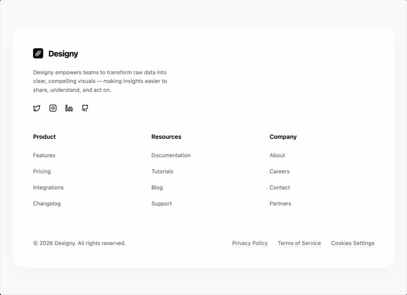
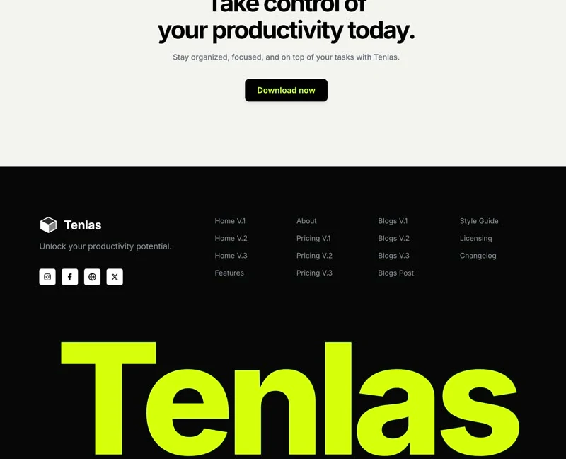
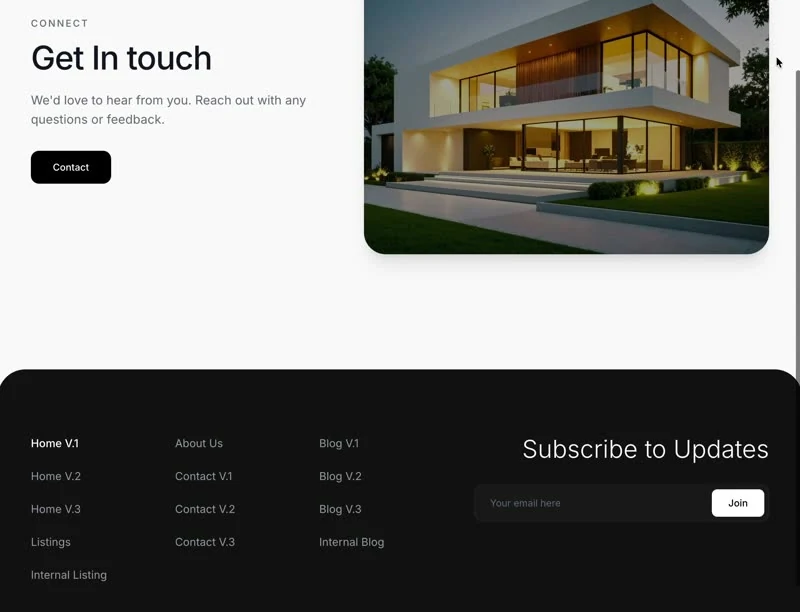
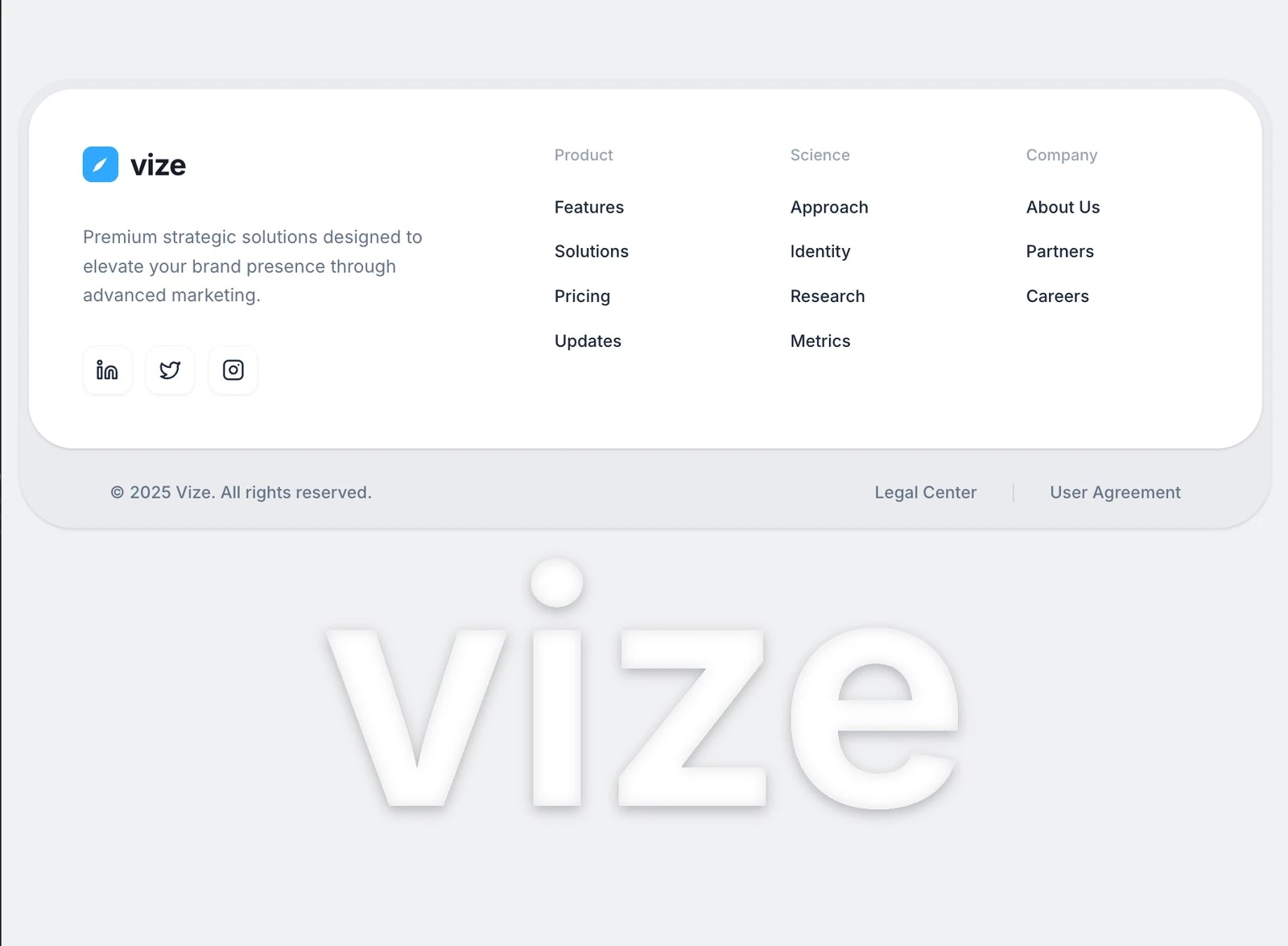
Vize Footer is a SaaS footer built from one written brief, and this page documents that brief. The colour scheme is black #000000 underneath and bright blue #31A8FF carrying the accents, and the page is set in Inter. Delivery is React and Tailwind CSS, captured at 1838x1350 so the frame is fixed before any code is written. It is the right reference for an AI or SaaS product footer that has to look deliberate on the first screen.
Designed for
- Designers who need the numbers first: type from 14px to 26px and 10px spacing steps, all of it quoted from the brief.
- People who brief a model on a footer will use the 7,734-character prompt as the starting point.
- Made for content leads rewriting a footer whose headline has to stay as long as Vize Footer's.
What's included
- One scale for type and frame. Sizes were read off the render at 1838x1350: type from 14px to 26px and 10px spacing steps. The frame proportions are recorded with the sizes, so a rebuild gets the aspect right as well. Keep the values that look arbitrary.
- Figures at display size. Statistics are handled as typography: figures at the display size, labels at the smallest step in the brief, all of it on #31A8FF or the ink colour rather than a coloured card. The figures carry the #31A8FF accent while everything around them stays on the ink colour.
- Cards do the structuring. The grid is the structure: panels of the same size, set in Inter, arranged so the eye moves across rather than down. Panel heights are driven by the copy, so a longer line does not break the alignment of the row. Cut a panel before you shrink the type.
- The brief names the steps. Spacing is quoted the same way (type from 14px to 26px and 10px spacing steps), not as a scale that grows on its own.
Motion & interaction
Hover, but sparingly
Interaction is local to each control here (hover states on the buttons and links rather than on every card), so nothing on the page moves as a side effect. A control that looks interactive behaves interactively, so there are no false affordances.
Static by design
This one is delivered as a still composition at 1838x1350, so the hierarchy has to work without motion, and it does. Only the elements that respond to the pointer move.
Making the footer yours
The trade-off is recognisability. Keep too much of Vize Footer and the page reads as someone else's; keep the numbers and change the content and it reads as yours. Rewrite the display line before you touch the colour.
The order behind the footer
The footer has a stated reading path. From there the eye takes the stats row, the card grid, the feature list and the footer in sequence, which is what keeps a single screen from reading as a list. A SaaS reader gets the offer before the options.
The timing behind the footer
Where a template animates every section on entry, this one animates hover and press states and then holds. Nothing animates for its own sake in this footer.
Frequently asked questions
What do I get when I copy the Vize Footer brief?
It is a build brief rather than a mood description: it names the composition at 1838x1350, the spacing and the motion values. Nothing in it treats the rendered image as the source of truth.
Can I rebuild the Vize Footer footer in a different stack?
Vize Footer was built in React and Tailwind CSS, and the entry says so for provenance. The brief describes positions, sizes and timings, so it rebuilds in any framework that can set type and place elements.
How should I handle the Vize Footer media in a client build?
The brief is a description, not a licence to redistribute someone else's assets. Keep the structure and the numbers, replace the media and the brand marks, and credit the source if a client asks where the layout came from. The reference was captured at 1838x1350.