About this template
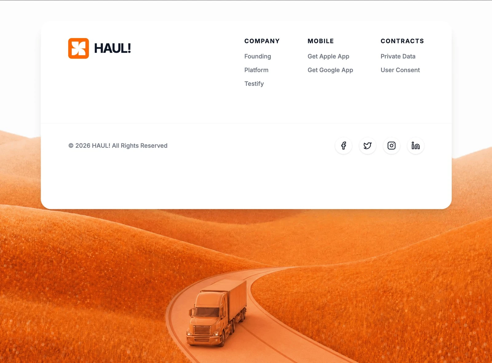
HAUL! is the footer reference for an AI or SaaS product, and the brief behind it is a full build spec rather than a mood board. It leads with “`. Next to the logo block, add the text” and gives that line the frame rather than shrinking it into a card. The colour scheme is white #FFFFFF underneath and orange #BB420D carrying the accents, and the page is set in Inter. Delivery is React and Tailwind CSS, captured at 1832x1354 so the frame is fixed before any code is written. The motion budget is 0.8s transitions. Take it on when the footer needs a decided order before any new sections are added.
Designed for
- Made for a solo founder shipping one footer for an AI or SaaS product and no design system behind them.
- Made for content leads rewriting a footer whose headline has to stay as long as HAUL!'s.
- People who brief a model on a footer will use the 4,329-character prompt as the starting point.
What's included
- Values you can check. The values are the specification: 50vh sections and 0.8s transitions, captured at 1832x1354 rather than inferred from a screenshot. There is no invented intermediate value between the named ones; the measurement list is the whole system.
- Scanning beats reading here. Where a run of copy would go, this page puts a set of panels, which is what keeps the footer scannable. The grid collapses to a single column without changing the panel order.
- Accent on controls only. Everything that is not #BB420D sits on white #FFFFFF, which is what makes the accent read as a signal rather than as decoration. Everything else sits on white #FFFFFF, which is what keeps a saturated palette legible.
- Every measurement is written down. Spacing is quoted the same way (50vh sections and 0.8s transitions), not as a scale that grows on its own.
Motion & interaction
Feedback on the controls
States are handled per component (hover states on the buttons and links rather than on every card) rather than by a global animation layer. A control that looks interactive behaves interactively, so there are no false affordances.
One scroll behaviour only
Parallax runs while the page is moving, so the composition has a defined resting state. Nothing about the effect changes the reading order of the sections. Check the composition with the effect removed.
What to change first in HAUL!
Set the new copy at the display size the brief names (50vh sections and 0.8s transitions), and the rest of the scale follows without a redesign. Your accent has to survive the same contrast test as the reference accent.
The numbers behind the footer
Where a mood board leaves the scale open, this brief closes it: 50vh sections and 0.8s transitions, with the surrounding values derived from that decision. Nothing in this footer depends on a default.
How the footer reflows
The brief describes what changes at each width (the section is held at 50vh), which means the mobile version is a decision rather than a squeeze. Contrast is held on the #BB420D accent over the media, and the video is muted and inline. A squeeze would have been cheaper and would not hold.
Frequently asked questions
What do I get when I copy the HAUL! brief?
It is a build brief rather than a mood description: it names the composition at 1832x1354, the spacing and the motion values. Nothing in it treats the rendered image as the source of truth.
Can I rebuild the HAUL! footer in a different stack?
HAUL! was built in React and Tailwind CSS, and the entry says so for provenance. The brief describes positions, sizes and timings, so it rebuilds in any framework that can set type and place elements.
How should I handle the HAUL! media in a client build?
The brief is a description, not a licence to redistribute someone else's assets. Keep the structure and the numbers, replace the media and the brand marks, and credit the source if a client asks where the layout came from. The reference was captured at 1832x1354.