About this template
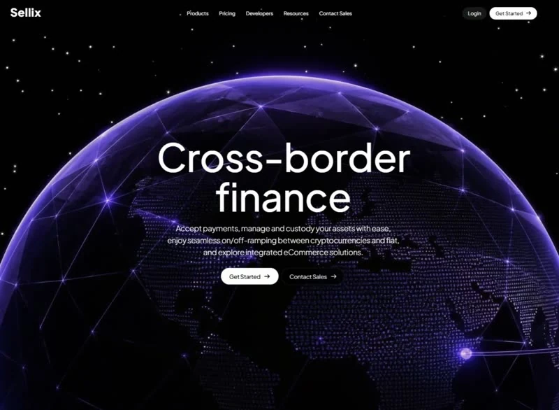
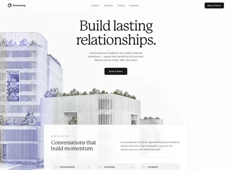
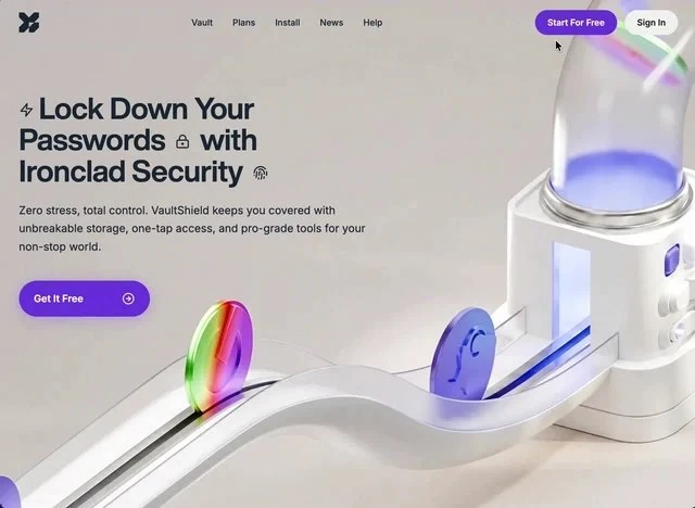
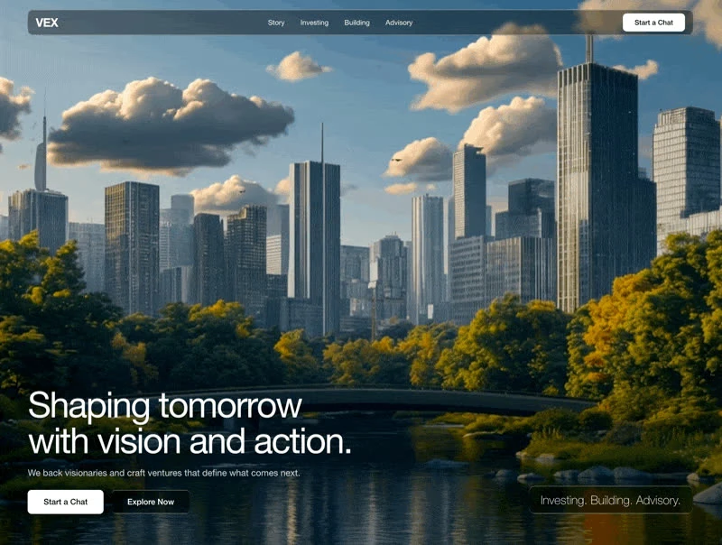
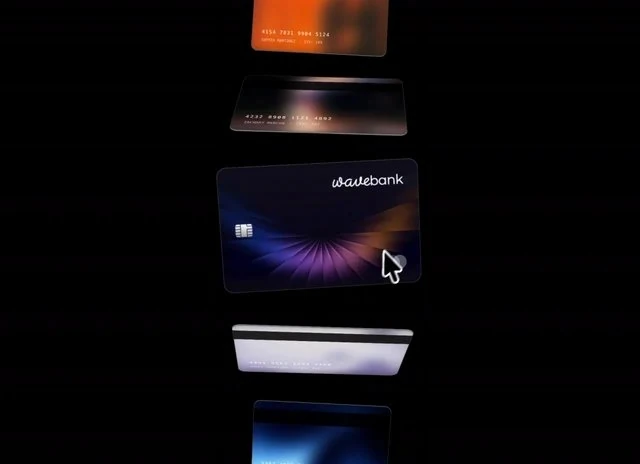
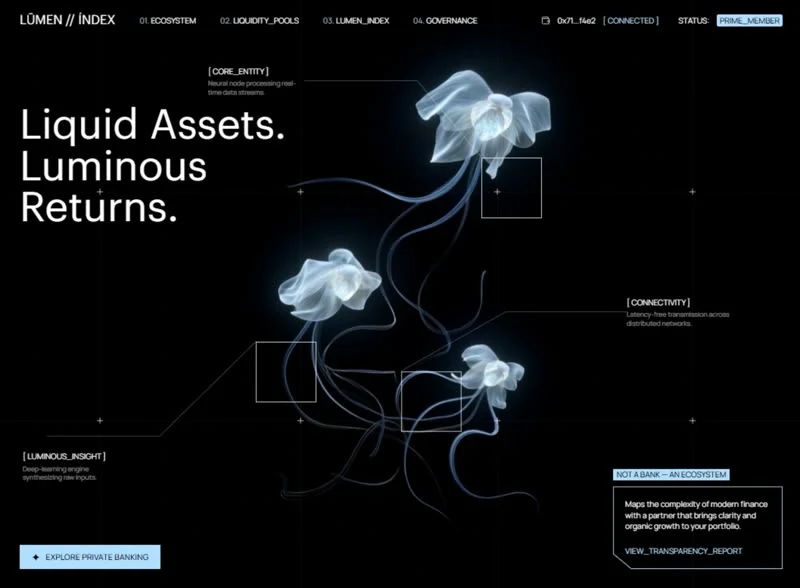
Tech-Forward was captured at 1464x1080 and kept as a specification rather than as a gallery image. The headline reads “One Card, Zero Limits. Worldwide”, and the rest of the hero section is arranged around it. The palette runs white #FDFBFA underneath, and the type is Inter. Delivery is React and Tailwind CSS, captured at 1464x1080 so the frame is fixed before any code is written. The brief spends its motion budget on 0.8s transitions and a looping video bed. Treat it as the brief for a fintech product hero section that has to hold up under a rebuild, not just a first look.
Designed for
- If three people have to edit this hero section, give content leads 100vh sections and 13px spacing steps rather than a screenshot.
- This hero section serves founders who need one screen of proof that fintech copy can carry 6s of looping video.
- People who brief a model on a hero section will use the 3,400-character prompt as the starting point.
What's included
- Links collapse at one width. A short run of links and a single action sit over the hero section, held at 100vh sections and 13px spacing steps so the bar never competes with the composition behind it. The bar sits over the 1464x1080 composition without a background of its own, so the media runs edge to edge underneath it.
- Proof in one row. The row is placed high in the hero section as proof rather than as decoration. Numbers share the interface face, so they belong to the page instead of interrupting it.
- The footer is a full composition. Links are grouped into columns with the wordmark in its own block, which keeps a long footer readable instead of turning it into a list. The accent is reused on one footer action rather than across the whole band. Group links; do not dump them.
- Navigation held to one row. The wordmark holds the left edge and the links run to the right of it, all of it set in Inter so the bar belongs to the page below rather than to a separate system.
Motion & interaction
Timings in milliseconds
Motion is measured in milliseconds here: 0.8s. That is the whole animation budget, and it is spent on state changes rather than on a scroll timeline. Easing is specified alongside the duration (0.8s), so a rebuild cannot quietly substitute a different feel. Keep the durations when you re-skin the page.
The loop does the ambient work
Ambient movement comes from the 6s 1464x1080 loop rather than from scroll effects, which keeps the page calm and the type readable. The clip is muted and inline, so the first frame is available without an interaction. Shoot or export at 1464x1080 or wider.
What moves in Tech-Forward
When a page feels restless, the cause is usually too many entrances. This one keeps the list short: 0.8s transitions and a 6s media loop. Nothing animates for its own sake in this hero section.
Reading Tech-Forward as a spec
3,400 characters of brief produce a full specification. The load-bearing part is short: 100vh sections, 13px spacing steps and 0.8s transitions. Nothing in this hero section depends on a default.
How the hero section reflows
Responsive here means the scale changes, not the hierarchy: the scale is fluid rather than stepped and the section is held at 100vh. Text stays above the fold, controls stay large enough to tap, and reduced motion is honoured. The mobile version is a decision, not a fallback.
Frequently asked questions
Is the Tech-Forward prompt a finished spec or a starting point?
It is a build brief rather than a mood description: it names the composition at 1464x1080, the spacing and the motion values. Nothing in it treats the rendered image as the source of truth.
Can I rebuild the Tech-Forward hero section in a different stack?
Tech-Forward was built in React and Tailwind CSS, and the entry says so for provenance. The brief describes positions, sizes and timings, so it rebuilds in any framework that can set type and place elements.
Can I use Tech-Forward in a client project?
The brief is a description, not a licence to redistribute someone else's assets. Keep the structure and the numbers, replace the media and the brand marks, and credit the source if a client asks where the layout came from. The reference was captured at 1464x1080.