About this template
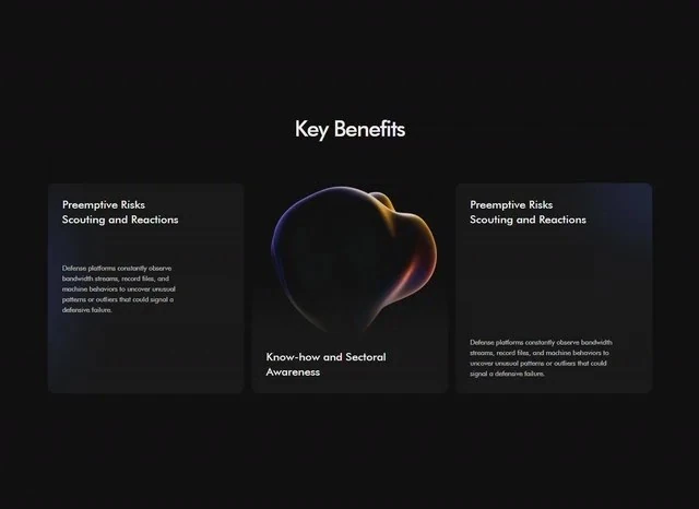
This is the features section from Guardnet Benefits, published with the brief that produced it rather than as a screenshot. The palette is black #0E0E0F underneath and blue #1E3A8A carrying the accents. The reference is built with React and Tailwind CSS, and the layout decisions are stated independently of it. It is most useful when the Fintech features section has to survive a copy change without a redesign.
Designed for
- Engineers who need the features section to survive a slow connection will use 640x466 and the type scale as the weight budget.
- Made for agencies that bill by the round and want type from 13px to 14px and 13px spacing steps agreed before the first one.
- Made for a solo founder shipping one features section for a fintech product and no design system behind them.
What's included
- Sizes fixed in the brief. Nothing here is eyeballed. The spec fixes type from 13px to 14px and 13px spacing steps, and the rest of the layout derives from those values. Spacing is quoted in the same units as the type, so the two can be compared directly.
- Labels under the figures. The row is placed high in the features section as proof rather than as decoration. The figures carry the #1E3A8A accent while everything around them stays on the ink colour.
- Structure in one screen. The features section is built so the copy lands before anything else: the type carries the hierarchy, the 640x466 frame holds the composition, and the supporting values stay quiet. The page is one composition at 640x466, which is why it holds together when the copy changes.
- The brief names the steps. Spacing is quoted the same way (type from 13px to 14px and 13px spacing steps), not as a scale that grows on its own.
Motion & interaction
Pointers only where they help
The page answers only where it can be acted on: hover states on the buttons and links rather than on every card. Hover and focus are specified together, so the pointer and the keyboard get the same information. Check the states on a touch device.
Static by design
This one is delivered as a still composition at 640x466, so the hierarchy has to work without motion, and it does. The composition holds still, so the hierarchy has to carry the page and it does.
Why this composition works for fintech
4,108 characters of brief produce one screen with no filler. The values in it are explicit (type from 13px to 14px and 13px spacing steps), which is why the composition still reads when the words change. Guardnet Benefits states the offer once and lets the composition repeat it rather than adding a second claim.
Reading Guardnet Benefits as a spec
Take the features section apart and the values still describe it: type from 13px to 14px and 13px spacing steps for the frame and the rhythm below. Nothing in this features section depends on a default.
The order behind the features section
Committing to one reading path means other paths are closed. The brief accepts that, fixes the stats row, the card grid and the background clip in place, and spends type from 13px to 14px and 13px spacing steps on making the route obvious. A fintech reader gets the offer before the options.
Frequently asked questions
What do I get when I copy the Guardnet Benefits brief?
The captured brief runs 4,108 characters and covers the frame, the type scale, the palette and the transitions. Copying it gives you that text, and sending it to Studio stages the same request with the page already described.
How is this Guardnet Benefits entry organised?
Everything quoted on the page comes from the captured 4,108-character brief rather than from a description written afterwards. That is why the numbers and the prose agree.
Why does the entry name React and Tailwind CSS at all?
Guardnet Benefits was built in React and Tailwind CSS, and the entry says so for provenance. The brief describes positions, sizes and timings, so it rebuilds in any framework that can set type and place elements.