About this template
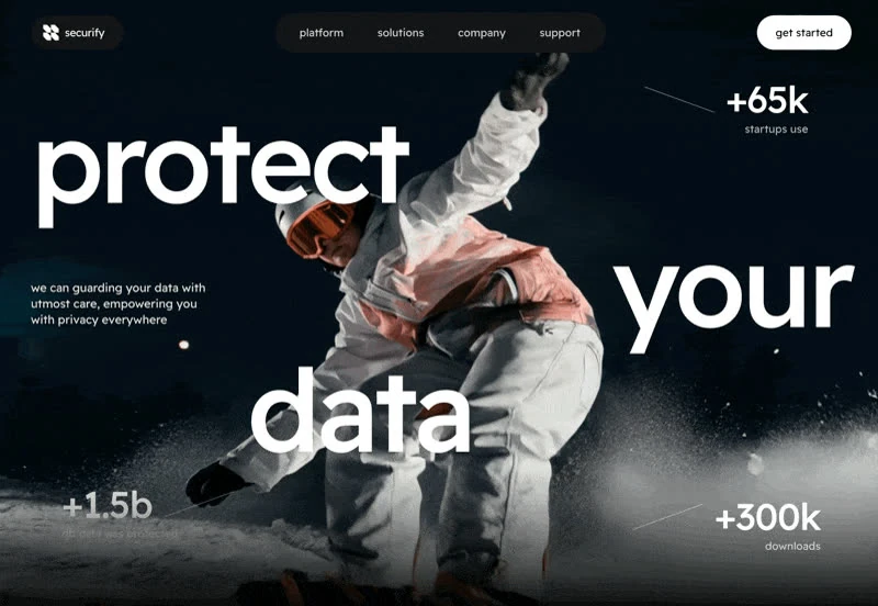
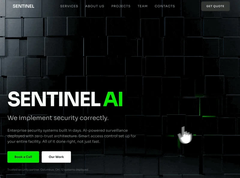
Read Asme as a hero section spec: the values were written down before the page was built. The colour scheme is black #000000 underneath and gray #C9CAB9 for the type, and the page is set in Instrument Serif. Delivery is React and Tailwind CSS, captured at 800x582 so the frame is fixed before any code is written. Motion is 500ms transitions, kept quiet enough that the copy still leads. Use it as the reference when you are building an AI or SaaS product hero section and want a finished composition instead of a starting point.
Designed for
- People who brief a model on a hero section will use the 4,360-character prompt as the starting point.
- Made for content leads rewriting a hero section whose headline has to stay as long as Asme's.
- If the launch is close, take the 800x582 frame and the 500ms entrance and leave the rest of the composition alone.
What's included
- A bar with nothing spare. Navigation is a single row with no second level under it. The bar sits over the 800x582 composition without a background of its own, so the media runs edge to edge underneath it. Design the collapsed state before adding a sixth link.
- One scale for type and frame. Nothing here is eyeballed. The spec fixes 500ms transitions, and the rest of the layout derives from those values. Values are quoted from the captured prompt rather than inferred, so they survive a re-render. Change the subject, not the steps.
- Type sets the hierarchy. With Instrument Serif doing the work, the sizes step down hard from the headline to the supporting copy and letter-spacing tightens as the size grows, so the hierarchy is carried by type rather than colour. Numerals share the interface face, so statistics and labels belong to the same system.
- A footer that carries the brand. Links are grouped into columns with the wordmark in its own block, which keeps a long footer readable instead of turning it into a list. The wordmark gets its own block, which keeps a long link list readable. Group links; do not dump them.
Motion & interaction
Pointer states, nothing more
The page answers only where it can be acted on: hover states on the buttons and links rather than on every card. The interactive states do not move layout, so nothing jumps under the pointer.
Fast enough to feel deliberate
Hover, press and focus all resolve in 500ms, which is what makes the interface feel immediate. The quoted timing covers state changes, so the feedback is the part of the motion that is specified.
How the hero section reflows
The narrow layout is designed, not inherited. the scale is fluid rather than stepped at each width, so the hierarchy survives the reflow. Autoplay and motion are handled honestly, so the page still communicates when they are unavailable.
What this hero section gets right
A tint layer over the media would have been the easy fix. The brief leaves it off. The media is a still at 800x582. The copy still holds because 500ms transitions keep the frame calm. It gives a SaaS reader the shortest honest route to the offer.
How Asme sequences the first read
Compare the top of this page with a typical SaaS landing screen. Both carry a headline and an action; here navigation, the headline, the stats row, the background clip and the footer sit in a fixed order instead of competing at the same weight. A SaaS reader gets the offer before the options.
Frequently asked questions
How long is the prompt behind Asme?
It is a build brief rather than a mood description: it names the composition at 800x582, the spacing and the motion values. Nothing in it treats the rendered image as the source of truth.
How much of Asme depends on React and Tailwind CSS?
Asme was built in React and Tailwind CSS, and the entry says so for provenance. The brief describes positions, sizes and timings, so it rebuilds in any framework that can set type and place elements.
How should I handle the Asme media in a client build?
The brief is a description, not a licence to redistribute someone else's assets. Keep the structure and the numbers, replace the media and the brand marks, and credit the source if a client asks where the layout came from. The reference was captured at 800x582.