About this template
Read Wellness Hero as a hero section spec: the values were written down before the page was built. Typography is Inter, and the brief fixes the sizes rather than leaving them to a scale. It ships as React and Tailwind CSS, so the whole hero section can be lifted into a project without a design handoff. Use it as the reference when you are building a health or wellbeing product hero section and want a finished composition instead of a starting point.
Designed for
- This hero section serves teams who have to justify a 640x468 frame to someone who was not in the kickoff.
- Made for a solo founder shipping one hero section for a health or wellbeing product and no design system behind them.
- Made for content leads rewriting a hero section whose headline has to stay as long as Wellness Hero's.
What's included
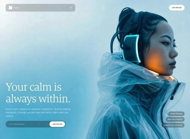
- Top row: wordmark, links, one action. The wordmark holds the left edge and the links run to the right of it, all of it set in Inter so the bar belongs to the page below rather than to a separate system. The bar sits over the 640x468 composition without a background of its own, so the media runs edge to edge underneath it. Test the bar over your own media before giving it a background.
- Links before the action. Hover and focus states are specified for every link, which is what stops a thin bar from feeling inert. Copy this pattern when you need navigation that survives a loud first screen.
- Type does the styling. The type is Inter at the top of the scale, with the supporting copy dropped well below it so the hierarchy needs no colour to read. Tracking is set per size, so the display line and the caption do not share one letter-spacing value.
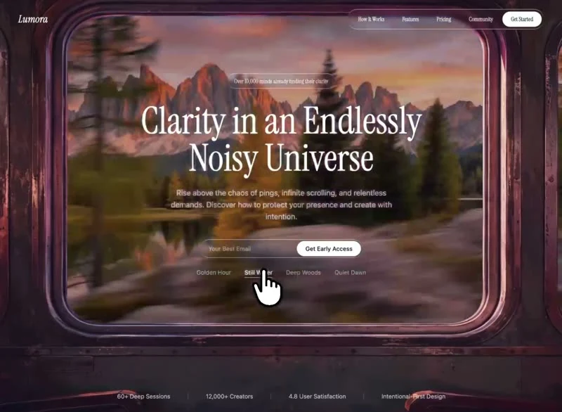
- A pill for the one thing that is new. One badge, one message: the pill sits above the headline in Inter at the smallest step, and nothing else competes for that slot. It is positioned so the headline keeps the centre of the composition. One badge, one message.
Motion & interaction
Almost no motion
There is no scroll library here: the 640x468 composition holds still and only the elements that respond to you move. Motion is treated as feedback rather than as decoration.
Motion that stays out of the way
Only the elements that respond to the pointer move.
The numbers behind the hero section
Every relationship on this page is a value you can check: a 640x468 frame. That is what makes Wellness Hero rebuildable rather than merely reproducible. Nothing in this hero section depends on a default.
The order behind the hero section
You could shuffle these blocks and the page would still load. It would stop reading as an argument, though: navigation, the headline, the announcement badge, the stats row and the background clip are a sequence, and a 640x468 frame only work in that order. A health reader gets the offer before the options.
What to change first in Wellness Hero
Compare this with starting from a blank page. Here the frame (640x468) and a 640x468 frame are already decided, so the work is substitution rather than composition. Keep the media crop; it is doing as much work as the type.
Frequently asked questions
Why is Wellness Hero's prompt not printed here?
Everything quoted on the page comes from the captured 4,719-character brief rather than from a description written afterwards. That is why the numbers and the prose agree.
What does the brief behind Wellness Hero actually contain?
It is a build brief rather than a mood description: it names the composition at 640x468, the spacing and the motion values. Nothing in it treats the rendered image as the source of truth.
How much of Wellness Hero depends on React and Tailwind CSS?
The reference happens to be built in React and Tailwind CSS. Nothing in the layout depends on that choice: the spacing, type and motion values transfer to whatever you already use.