About this template
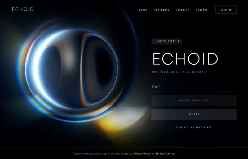
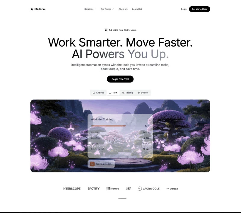
Luminex was captured at 800x600 and kept as a specification rather than as a gallery image. The palette is deep blue #010A12 underneath, white #CFDDD8 for the type and blue #143F62 carrying the accents. Delivery is React — one page, no plugin, no build tooling between you and the design. Keep it open while you write: the 162-character brief is the part that transfers to your own page.
Designed for
- Made for product managers who need the hero section scoped to one sprint and no new assets.
- Studio leads who run several projects at once will use this hero section as the pattern every other page copies.
- Product teams writing their own Hero section copy who need every line to keep the length the display type was sized for.
What's included
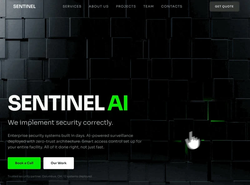
- A bar with nothing spare. A short run of links and a single action sit over the hero section, held at a 800x600 frame so the bar never competes with the composition behind it. The links are set below the wordmark in size, and the #143F62 action is the only element in the bar with any weight. Design the collapsed state before adding a sixth link.
- Navigation held to one row. Copy this pattern when you need navigation that survives a loud first screen.
- One accent, used sparingly. Blue #143F62 is the only saturated value in the composition; everything else sits on deep blue #010A12. Buttons, links and small highlights borrow it, which is what keeps a busy first screen readable. Everything else sits on deep blue #010A12, which is what keeps a saturated palette legible.
- Copy first, decoration second. The hero section is built so the copy lands before anything else: the type carries the hierarchy, the 800x600 frame holds the composition, and the supporting values stay quiet. The page is one composition at 800x600, which is why it holds together when the copy changes.
Motion & interaction
Motion that stays out of the way
There is no scroll library here: the 800x600 composition holds still and only the elements that respond to you move. Only the elements that respond to the pointer move.
Static by design
The brief leaves animation out and lets the 800x600 layout carry the page, with hover and press states the only changes. Stillness is a valid choice.
The order behind the hero section
Compare the top of this page with a typical SaaS landing screen. Both carry a headline and an action; here navigation sit in a fixed order instead of competing at the same weight. A SaaS reader gets the offer before the options.
How the hero section reflows
Responsive here means the scale changes, not the hierarchy: the scale is fluid rather than stepped. Text stays above the fold, controls stay large enough to tap, and reduced motion is honoured. Autoplay and motion are handled honestly, so the page still communicates when they are unavailable.
What to change first in Luminex
One line, one font, one accent: those three substitutions change the design most. a 800x600 frame are the values that should not move. Rewrite the display line before you touch the colour.
Frequently asked questions
Where did the Luminex design come from?
The reference was collected from motionsites.ai, and the media belongs to them. Rebuild the composition with your own copy, imagery and palette, and check the source site's terms before you ship anything taken from it.
Is the Luminex prompt a finished spec or a starting point?
The captured brief runs 162 characters and covers the frame, the type scale, the palette and the transitions. Copying it gives you that text, and sending it to Studio stages the same request with the page already described.
Can I rebuild the Luminex hero section in a different stack?
No. The brief is a specification, not a dependency list. It was written for React, but the same composition rebuilds in whatever you already use. The stack is named so you know how the reference was made.