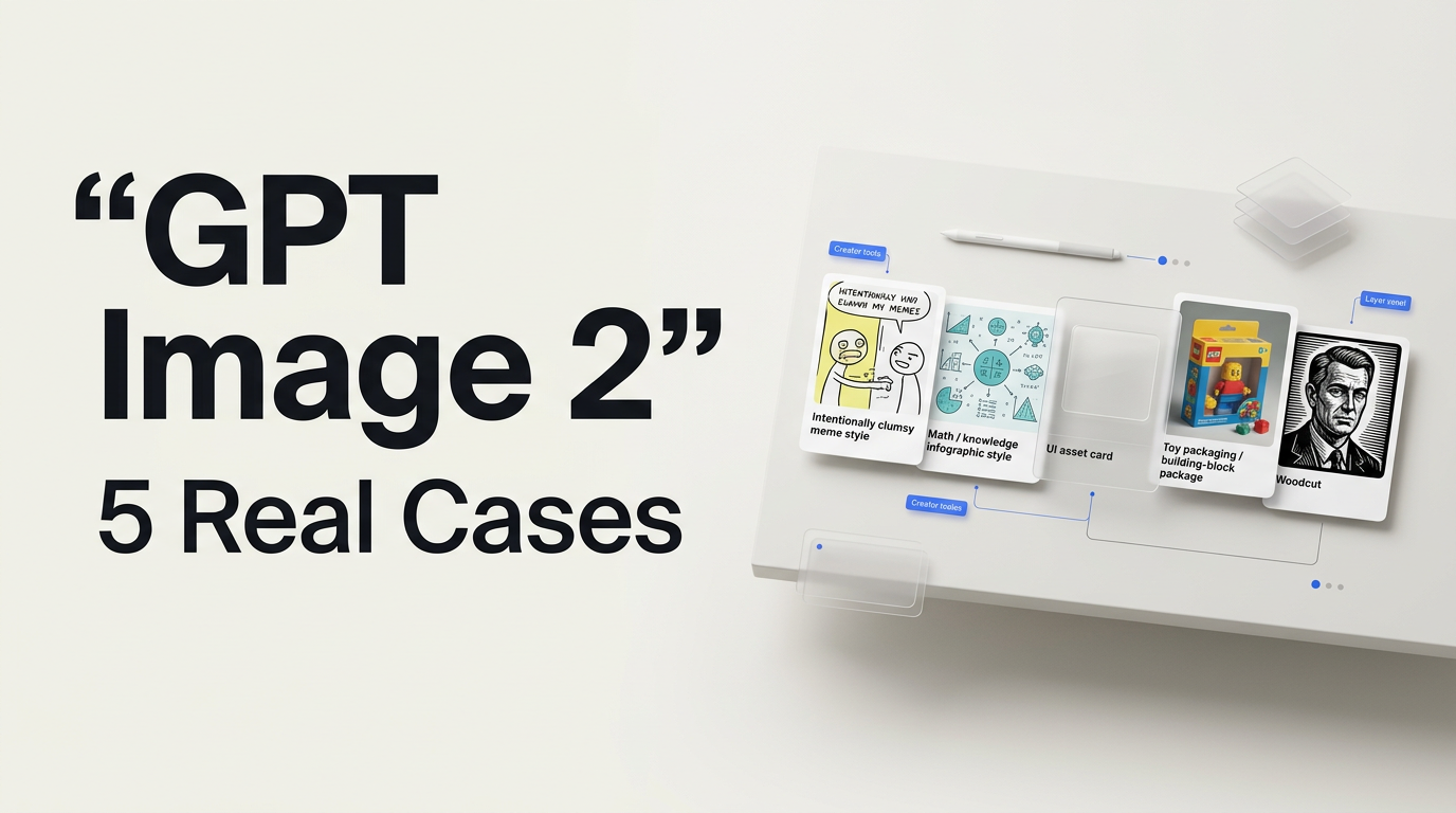
Case Collection
GPT Image 2 Use Cases Worth Trying
Introduction
After GPT Image 2 launched, X quickly filled with real user examples. At first glance they looked like ordinary AI image demos. After looking closer, some of them felt more like new work patterns than image showcases.
Here are five representative cases: intentionally bad MS Paint memes, math explainer graphics, transparent UI assets, Lego-style product packaging, and woodcut portrait conversions.
1. So ugly it looks mouse-drawn: AI starts to understand "intentionally bad"
Case source: CHOI / @arrakis_ai

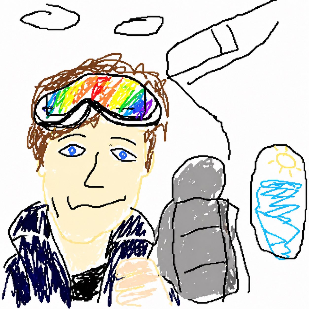
The most counterintuitive part is that it does not try to look good. While everyone else asks AI to be more polished, realistic, and cinematic, this prompt twists the direction back: draw it clumsier, rougher, like someone quickly dragged a mouse around in MS Paint.
What made it spread is the model's feel for a subtle balance: the subject is still recognizable, the composition still maps to the source, but every line is deliberately crooked, weak, and awkward.
In Ottermind, this kind of style can turn dense reports, research notes, or competitive analysis into lightweight covers people actually want to open.
Redraw this image as a very clumsy MS Paint doodle: crooked lines, casual coloring, inaccurate proportions, but keep the subject recognizable. Do not make it polished. It should feel like an ordinary person quickly drew an internet meme with a mouse.2. The same math problem can produce several different explanations
Case source: Jeffrey Emanuel / @doodlestein
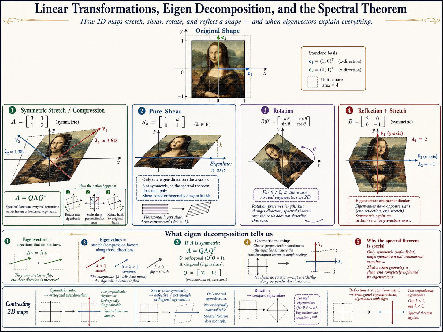
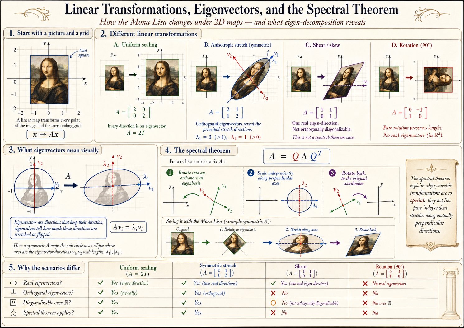
The real point in the original post is not simply "AI can finally draw math diagrams." It is that the same detailed prompt can produce meaningfully different results when generated multiple times.
In knowledge work, the missing piece is often not another note. It is the one visual that makes the note understandable. A good infographic needs the title, hierarchy, arrows, labels, and visual metaphor to live inside the same logic.
Create a teaching infographic for this math concept: use a clear title, step-by-step structure, arrows, coordinates/shapes, and short labels to explain the core logic. It should feel like a teacher explaining on a whiteboard, but with cleaner layout than handwriting.3. Transparent UI assets: not just beautiful, actually usable
Case source: Anul Agarwal / @anulagarwal
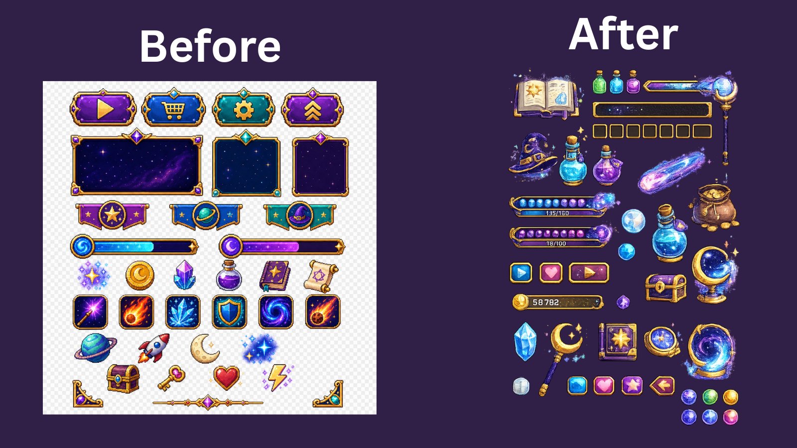
The biggest problem for product and design users is not whether an image is impressive. It is whether the image can actually be used. Many AI images look cool on social media, but fall apart when placed into a real interface, slide deck, web page, or game prototype: the background is too busy, edges are dirty, elements cannot be separated, and the style is hard to continue.
Transparent UI and game assets are closer to a real workflow: isolated elements, unified lighting, clean edges, and a composable visual system.
Generate a set of transparent PNG assets that can be used directly in an interface or game prototype: isolated subjects, clean edges, no background, unified lighting, and consistent material style. Each element should be usable on its own inside a UI.4. Lego packaging experiments: push an idea until it feels orderable
Case source: Dennison Bertram / @dennisonbertram
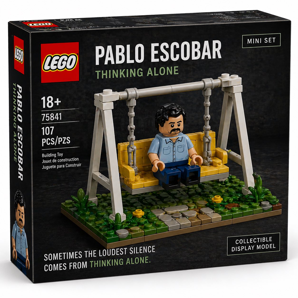
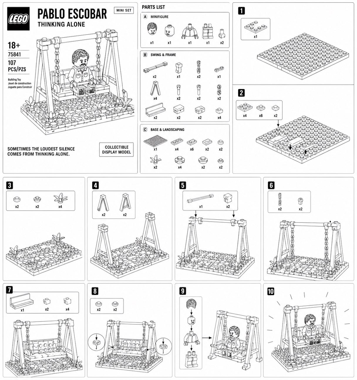
The gripping part of the Lego packaging examples is that they do not feel like ordinary style images. They feel like sets you could actually order.
Packaging pushes a concept to the edge of commercialization: it has a name, structure, display logic, and a purchase cue. That is often the missing step when teams discuss creative ideas.
Design this person/place/product concept as a Lego-style set package: include the set name, main box art, brick parts display, set number, age label, and shelf-display feeling. It should look like a real product someone could buy.5. Turning ordinary photos into prints: a coherent set matters more than one stunning image
Case source: Linus Ekenstam / @LinusEkenstam
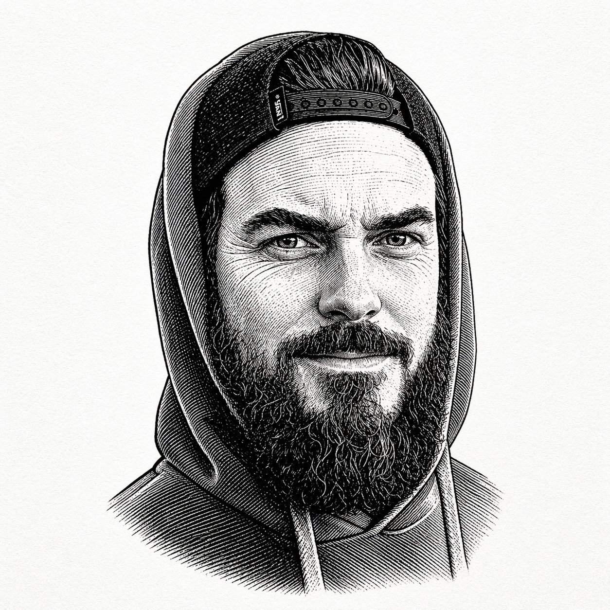
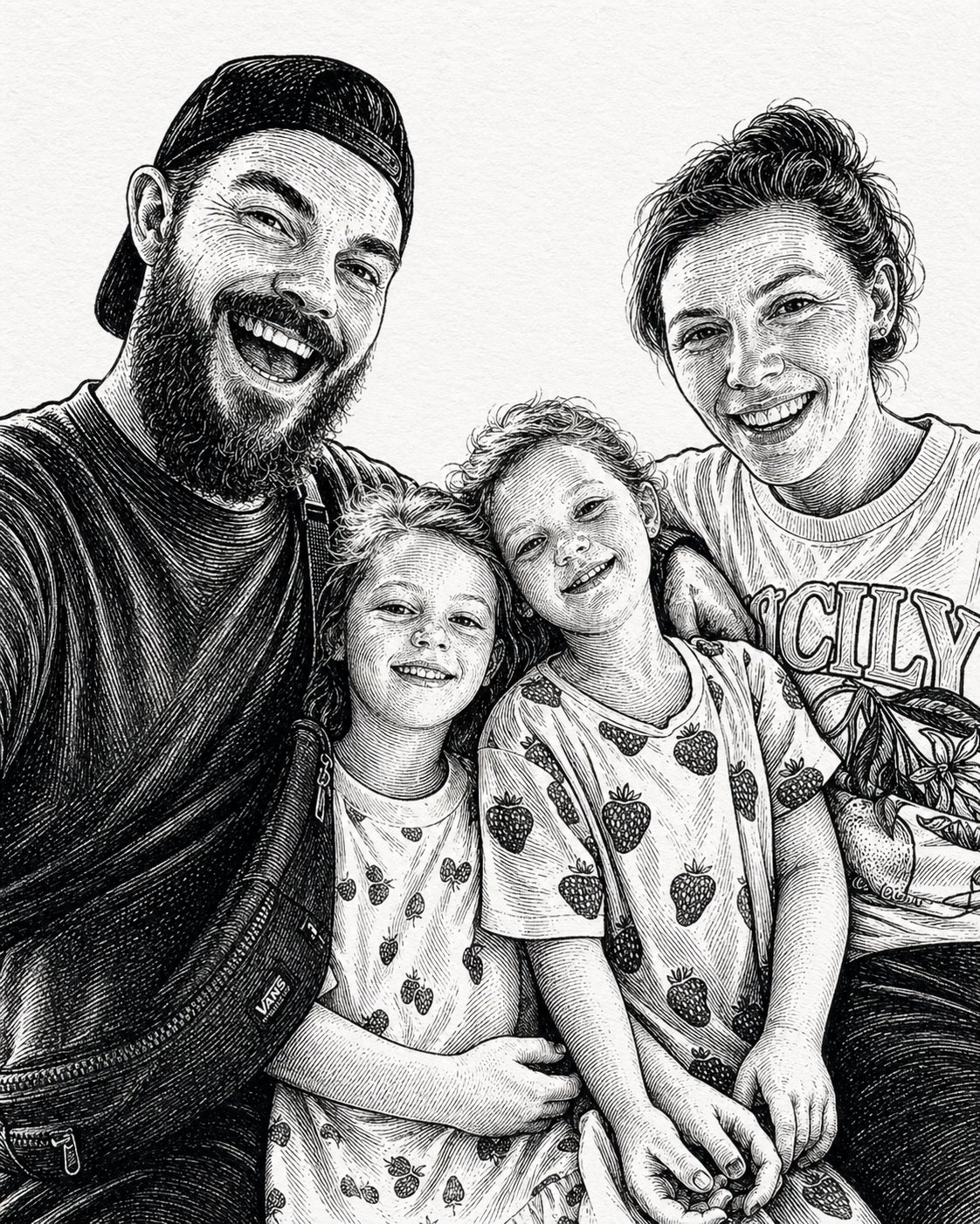
Woodcut and linocut transformations are easy for everyday users to understand because the use cases are immediate: avatars, family photos, gifts, and topic covers.
For knowledge bases and topic pages, this matters too. Not every image needs to be astonishing. Sometimes the real value is giving a group of materials a stable, recognizable mood.
Convert this photo into a woodcut / linocut print style: use bold lines, high-contrast black-and-white relationships, light handmade texture, and clear contours. Preserve the person's recognizable features, but make the overall result feel like part of a coherent series of topic covers.In Ottermind, turn a moment of inspiration into a reusable prompt
If you only generate an occasional image, GPT Image 2 is a toy. When it connects to your pages, notes, PDFs, meetings, and project context, it becomes part of a knowledge workflow.
Ottermind can turn saved materials into visual covers, long notes into infographics, cases into reusable prompt templates, and creative projects into fast visual tests.