Plantilla web
Big Picture
Big Picture is a free, fully responsive HTML5 and CSS3 site template by HTML5 UP.
La descripción de esta plantilla aún no está disponible en español, así que se muestra en inglés.
Website · Gratis
Páginas
Capturas de la demo, página a página. Desplázate dentro de cada página para verla entera.
Análisis del diseño
Una lectura por IA del diseño de esta plantilla: colores, tipografía, espaciado, secciones y detalles característicos. Ottermind parte de ella cuando usas la plantilla.
Este análisis aún no está disponible en español, así que se muestra en inglés.
- Overall
personal portfolio, minimalist, low density, light
- Palette
background #fafbfd; surfaces [#dee0e3, #373d49, #e7746f, #676d79]; text #676d79; muted text #ffffff; primary #e7746f; accents []
- Type
headings Source Sans Pro, 600, sentence-case; body Source Sans Pro, 22px; scale h1 16px, h2 35px, h3 22px
- Shape & spacing
button radius 4px; no borders; no shadows; section spacing 80px; content width 1200px
- Sections (top to bottom)
- Header — fixed, full-width, white background with logo on left, navigation links right-aligned, dark gray text
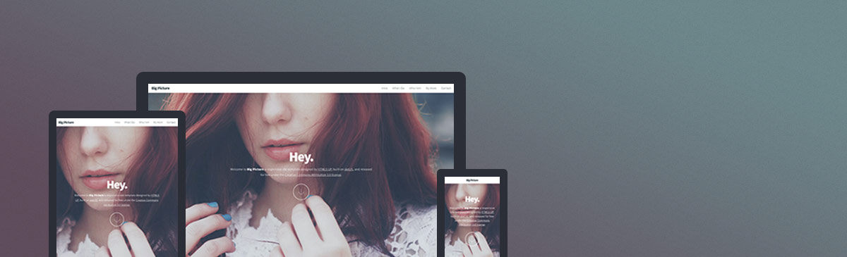
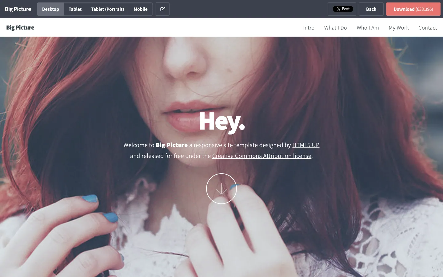
- Hero — full-bleed image background with overlay, centered "Hey." headline in large white text, subtext below in smaller white, downward arrow icon in thin white circle below
- Navigation — horizontal, top-aligned, white background, dark gray text, no underline
- Signature details
- Full-bleed hero image with semi-transparent overlay
- Centered, minimal typographic hierarchy
- Downward scroll indicator as a circular outline with arrow
- Fixed header with clean, spaced navigation
- Use of soft contrast between text and image background
- Consistent use of Source Sans Pro across all elements
- Other pages
- /intro: intro section with paragraph and two CTA buttons
- /what-i-do: grid layout with three columns of services
- /who-i-am: single-column bio with image on left
- /my-work: portfolio grid with project thumbnails
- /contact: contact form with input fields and submit button
Detalles de la plantilla
- Categoría
- Website
- Tecnología
- HTML5
- Licencia
- CC-BY-3.0
- Autor
- HTML5 UP
- Publicada en
- HTML5 UP
- Precio
- Gratis
- HTML5
- Responsive
Diseño original de HTML5 UP, publicado en HTML5 UP. Ottermind no copia el código de la plantilla: crea una web nueva a partir del briefing.
El briefing del que parte Ottermind
Se abre en Studio como borrador: añade tu marca, tu público y tus páginas antes de enviarlo.
Build a website website inspired by the "Big Picture" template. Reference brief: Big Picture is a free, fully responsive HTML5 and CSS3 site template by HTML5 UP. Style and features to reflect: HTML5, Responsive. Use original copy and imagery for my brand rather than the reference's placeholder content.
Cómo usar esta plantilla
- 1
Haz clic en «Usar esta plantilla» para abrirla en Ottermind Studio con el briefing ya escrito.
- 2
Añade al briefing tu marca, tu público, las páginas y el contenido.
- 3
Ottermind crea una web nueva inspirada en este diseño; sigue ajustándola en el chat.