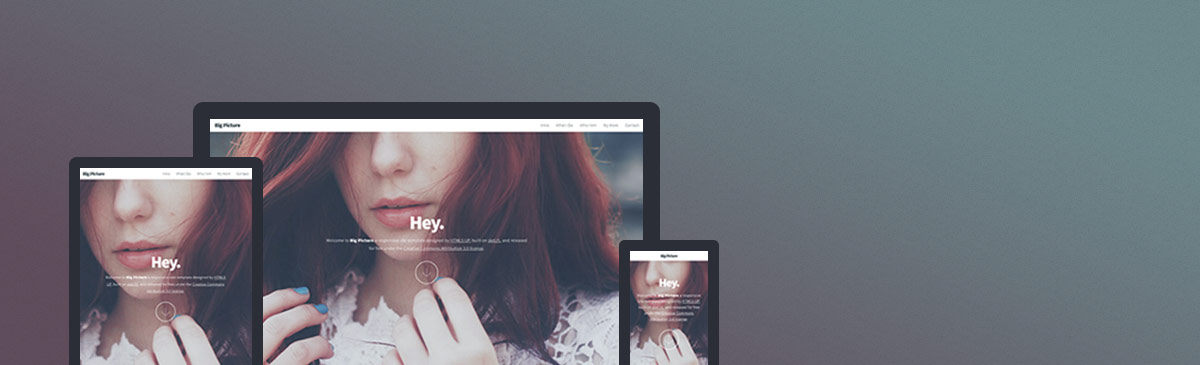
Webサイトテンプレート
Big Picture
Big Picture is a free, fully responsive HTML5 and CSS3 site template by HTML5 UP.
このテンプレートの説明はまだ日本語に対応していないため、英語で表示しています。
Website · 無料
ページ
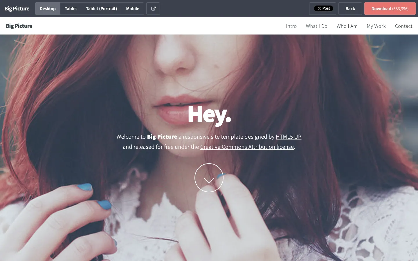
ライブデモのページごとのスクリーンショットです。枠内をスクロールするとページ全体を見られます。
デザイン解説
このテンプレートのデザインを AI が読み解いたものです:配色、書体、余白、セクション、特徴的なディテール。テンプレートを使うと Ottermind はここから始めます。
この解説はまだ日本語に対応していないため、英語で表示しています。
- Overall
personal portfolio, minimalist, low density, light
- Palette
background #fafbfd; surfaces [#dee0e3, #373d49, #e7746f, #676d79]; text #676d79; muted text #ffffff; primary #e7746f; accents []
- Type
headings Source Sans Pro, 600, sentence-case; body Source Sans Pro, 22px; scale h1 16px, h2 35px, h3 22px
- Shape & spacing
button radius 4px; no borders; no shadows; section spacing 80px; content width 1200px
- Sections (top to bottom)
- Header — fixed, full-width, white background with logo on left, navigation links right-aligned, dark gray text
- Hero — full-bleed image background with overlay, centered "Hey." headline in large white text, subtext below in smaller white, downward arrow icon in thin white circle below
- Navigation — horizontal, top-aligned, white background, dark gray text, no underline
- Signature details
- Full-bleed hero image with semi-transparent overlay
- Centered, minimal typographic hierarchy
- Downward scroll indicator as a circular outline with arrow
- Fixed header with clean, spaced navigation
- Use of soft contrast between text and image background
- Consistent use of Source Sans Pro across all elements
- Other pages
- /intro: intro section with paragraph and two CTA buttons
- /what-i-do: grid layout with three columns of services
- /who-i-am: single-column bio with image on left
- /my-work: portfolio grid with project thumbnails
- /contact: contact form with input fields and submit button
テンプレート情報
- カテゴリ
- Website
- 技術
- HTML5
- ライセンス
- CC-BY-3.0
- 作者
- HTML5 UP
- 掲載元
- HTML5 UP
- 価格
- 無料
- HTML5
- Responsive
オリジナルデザイン:HTML5 UP(HTML5 UP に掲載)。Ottermind はテンプレートのコードをコピーせず、ブリーフをもとに新しいサイトを作ります。
Ottermind が起点にするブリーフ
Studio で下書きとして開きます。送信前にブランド、対象者、ページを書き足してください。
Build a website website inspired by the "Big Picture" template. Reference brief: Big Picture is a free, fully responsive HTML5 and CSS3 site template by HTML5 UP. Style and features to reflect: HTML5, Responsive. Use original copy and imagery for my brand rather than the reference's placeholder content.
このテンプレートの使い方
- 1
「このテンプレートを使う」をクリックすると、ブリーフ入りで Ottermind Studio が開きます。
- 2
ブリーフにブランド、対象者、ページ、内容を書き足します。
- 3
Ottermind がこのデザインに着想を得た新しいサイトを作ります。チャットで続けて調整できます。