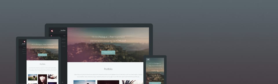
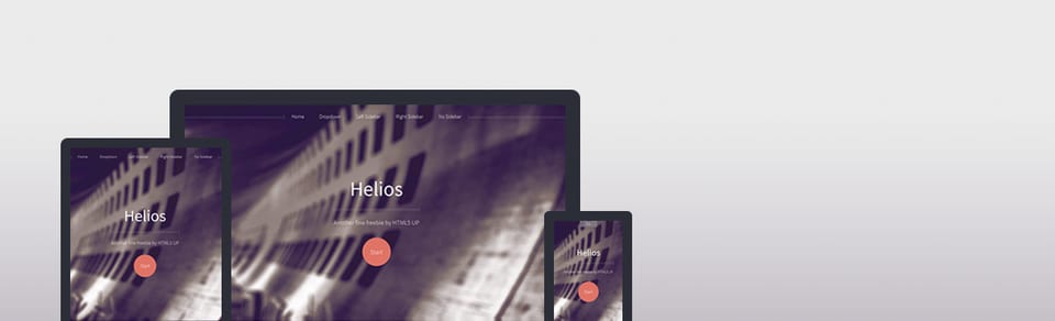
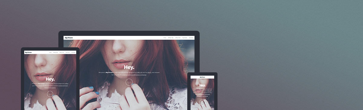
웹사이트 템플릿
Big Picture
Big Picture is a free, fully responsive HTML5 and CSS3 site template by HTML5 UP.
이 템플릿의 설명은 아직 한국어로 제공되지 않아 영어로 표시됩니다.
Website · 무료
페이지
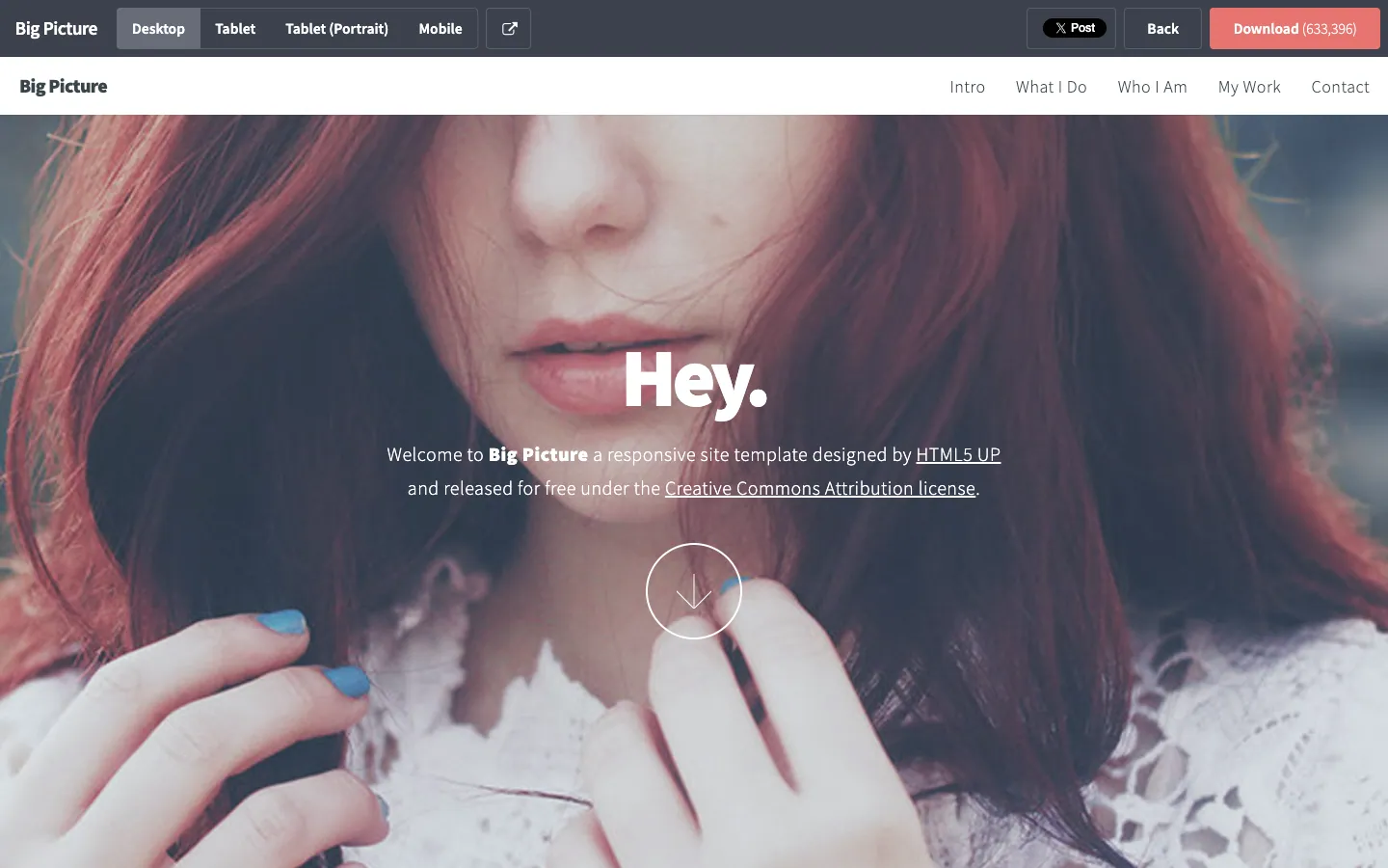
라이브 데모의 페이지별 스크린샷입니다. 페이지 안에서 스크롤하면 전체를 볼 수 있습니다.
디자인 분석
이 템플릿 디자인을 AI가 분석한 내용입니다: 색상, 글꼴, 여백, 섹션, 특징적인 디테일. 템플릿을 사용하면 Ottermind가 여기에서 시작합니다.
이 분석은 아직 한국어로 제공되지 않아 영어로 표시됩니다.
- Overall
personal portfolio, minimalist, low density, light
- Palette
background #fafbfd; surfaces [#dee0e3, #373d49, #e7746f, #676d79]; text #676d79; muted text #ffffff; primary #e7746f; accents []
- Type
headings Source Sans Pro, 600, sentence-case; body Source Sans Pro, 22px; scale h1 16px, h2 35px, h3 22px
- Shape & spacing
button radius 4px; no borders; no shadows; section spacing 80px; content width 1200px
- Sections (top to bottom)
- Header — fixed, full-width, white background with logo on left, navigation links right-aligned, dark gray text
- Hero — full-bleed image background with overlay, centered "Hey." headline in large white text, subtext below in smaller white, downward arrow icon in thin white circle below
- Navigation — horizontal, top-aligned, white background, dark gray text, no underline
- Signature details
- Full-bleed hero image with semi-transparent overlay
- Centered, minimal typographic hierarchy
- Downward scroll indicator as a circular outline with arrow
- Fixed header with clean, spaced navigation
- Use of soft contrast between text and image background
- Consistent use of Source Sans Pro across all elements
- Other pages
- /intro: intro section with paragraph and two CTA buttons
- /what-i-do: grid layout with three columns of services
- /who-i-am: single-column bio with image on left
- /my-work: portfolio grid with project thumbnails
- /contact: contact form with input fields and submit button
템플릿 정보
- 카테고리
- Website
- 기술
- HTML5
- 라이선스
- CC-BY-3.0
- 제작자
- HTML5 UP
- 게시처
- HTML5 UP
- 가격
- 무료
- HTML5
- Responsive
원본 디자인: HTML5 UP (HTML5 UP에 게시). Ottermind는 템플릿 코드를 복사하지 않고, 브리프를 바탕으로 새 사이트를 만듭니다.
Ottermind가 시작하는 브리프
Studio에서 초안으로 열립니다. 보내기 전에 브랜드, 대상, 페이지를 추가하세요.
Build a website website inspired by the "Big Picture" template. Reference brief: Big Picture is a free, fully responsive HTML5 and CSS3 site template by HTML5 UP. Style and features to reflect: HTML5, Responsive. Use original copy and imagery for my brand rather than the reference's placeholder content.
이 템플릿 사용 방법
- 1
“이 템플릿 사용하기”를 누르면 브리프가 채워진 상태로 Ottermind Studio가 열립니다.
- 2
브리프에 브랜드, 대상, 페이지, 콘텐츠를 추가하세요.
- 3
Ottermind가 이 디자인에서 영감을 받은 새 사이트를 만듭니다. 채팅으로 계속 다듬으세요.